Jean Charlot's first fresco: The Massacre in the Main Temple. John Charlot. Jean Charlot Collection, website. 2001.
Jean Charlot's first fresco, The Massacre in the Main Temple, is important first and foremost as an art work of permanent value. Painted from October 2, 1922, to January 31, 1923, on a wall of unusual shape (14 feet by 26 feet) in a stairwell of the Escuela Preparatoria, now the Antiguo Colegio de San Ildefonso, The Massacre also has considerable historical importance as the first fresco completed in Mexico since the Colonial Period[2] and as the first completed mural of the young group that produced the major work of the Mexican Mural Renaissance. Indeed, for some time Charlot's mural was the only visible evidence of the work of that group, since Diego Rivera's Creation, which had been started earlier, was still unfinished and behind closed doors in the amphitheater of the Escuela Preparatoria.[3] Also important were Charlot's choice of medium—fresco became the medium of choice for the Mural Renaissance—and selection of the theme of the Conquest. Rivera would even quote the mural's lances in his own mural on the staircase of the Palacio Nacional, Historia de Mexico, desde la época prehispanica al futuro. Finally, the making of the fresco was the culminating moment of Charlot's early career, the point towards which he had been working for many years: "I had trained myself already to be ready, shall we say, if the possibility of making murals would come, and it's very nice that it did come" (Interview, August 7, 1971); "I would say that I was supremely happy when I painted that first fresco of mine" (Charlot March 8, 1972). He would help Rivera on the Creation through the day and work on his own mural afterwards: "While I painted far into the night by the light of a raw electric bulb, my spirit was prone to wander and to whisper how such and such hard-won effects were as dazzling as Picasso's" (Charlot 1963: 184 f.). Charlot characteristically turns the account to humor, but his youthful elation is obvious. Indeed, what he remembered best from the Mexican Mural Renaissance was not the many discussions and parties, but the work of painting; a mural painter is happy only when painting murals.
Charlot's own writings on his first fresco are primary sources for understanding it. The best known are the relevant sections of The Mexican Mural Renaissance: 1920-1925 (1963), for which he used his journal. A more contemporary work is his unpublished French "Réponse à Molina" (1923a, Appendix II), prompted by the April 1923 newspaper attack by Renato Molina Enriquez, "El 'Fresco' de Charlot en la Escuela Preparatoria."[4] Shortly afterwards, Charlot wrote a memorandum on the technique of his fresco, "Aide-Mémoire Technique" (1923b, Appendix III, probably meant as a help for his colleagues working in the same medium and as a defense against another newspaper attack.[5] Some notes on the fresco are found in a notebook that Charlot started during the Occupation in Ludwigshafen, Germany, in 1920 and continued using until 1924; and in a notebook (called by me Notebook C) that he used from 1918 to 1923. Charlot devoted to the mural a section of his lectures at the Walt Disney studios, Pictures and Picture Making: A Series Of Lectures (1938, Appendix IV),[6] as well as discussing the work in interviews with me in 1970-1971. In the mid-1940s, Charlot also collected much relevant material on the period for The Mexican Mural Renaissance. Charlot's Traité de Peinture—which he started in 1920 before traveling to Mexico and took up again in 1922—provides information on his general theory of art at the time, as do his Spanish and unpublished French articles. A number of visual materials are available from the preparation of the mural; the majority of those materials were, however, lost when Charlot entrusted them to Alfons Goldschmidt, who was preparing an exhibition in Germany.[7]
The Massacre in the Main Temple is clearly a large subject, and I will sketch only a few points in this essay, with some emphasis on those that have been raised in the secondary literature.
An important decision was to paint the mural in fresco.[8] Charlot was, of course, aware of the major importance of that medium in mural art, especially liturgical, and he was intrigued all his life by technical craft problems. In November 1916, he gave a lecture to the Gilde Notre-Dame—the liturgical arts group to which he belonged—which later became his first published article (1917-1918). In it, Charlot rejects much of the modern idea of artist and opts for the ideal of the good craftsman: "Nous repoussons presque le titre d'artiste" 'We reject almost the title of artist.' In order to find and perfect the most appropriate media for their work, he and his colleagues most often attempt techniques that have been abandoned in modern art: "On essaie la peinture à la fresque, la peinture à la colle, le bois polychromé..." 'One tries fresco, glue colors,[9] polychromed wood...' The problem was that those techniques were not being taught. He calls therefore for "conférences techniques" 'technical conferences' especially on "les différentes méthodes d'expression : peinture à l'œuf, à la fresque" 'the different methods of expression: tempera, fresco,' and so on. Charlot thought he had read Paul Baudouin's book on fresco among his technical studies in France:[10]
I had probably read it before going to Mexico. I had wanted to work in fresco and was going to put in fresco in the parish church. I probably studied fresco for it then. But Marcel-Lenoir is the real beginning here. Through him, I got the desire to do fresco.
He recalled that there was an École de Fontainebleau de fresque around 1910, and "I was studying in the Bibliothèque des Arts Décoratifs. They had a lot on techniques, and it was probably there that I learned about fresco."
Charlot seems early to have treated fresco as a touchstone of his thinking about murals. In his poem La Cité of December 1919, he describes young artists in his imagined society:
Il y a là des jeunes gens pas sages du tout—en feutre et pantalon de velours—et des palettes aux mains—il chantent et rient—et de belles jeunes filles nues posent—Ils enfresquent les murs de ces belles formes, et l'œuvre finie, joyeux, rendent grâce.
'There are some young people, not at all wise—in felt and velvet pants—with palettes in their hands—they sing and laugh—and beautiful nude young women pose—They fresco the walls with these beautiful forms, and when the work is done, joyous, they give thanks.'
In a note on an exhibition of Ingres, written on his brief return trip from Mexico to Paris in 1921, Charlot writes: "Méthode apte à la décoration (Ingres tend à la fresque) mais peu agréable dans un tableau de chevalet" 'Method apt for decoration (Ingres tends to fresco), but little agreeable in an easel painting' (Charlot 1918-1923). Charlot's planned mural for a church in Paris would have been in fresco (Charlot 1963: 178), and he did his "masterpiece" (in the guild sense), L'Amitié, in gouache because that medium was as close as he could get to fresco.
In Mexico, the problems of doing a fresco without a teacher or training were daunting. As he would throughout his life, Charlot simply tackled the problem directly (Charlot 1963: 130 f., 181, 184). He borrowed from Rivera his copy of Baudouin's book on fresco and studied "the ways of Mexican masons and Mexican mortars" among the construction workers at the Preparatoria. With books, observation, the experience of the actual work, and the active collaboration of the master mason Luis Escobar, he completed, not an experiment, but a whole wall, and in very little time.[11]
This technical feat seems to have caused some surprise among the other artists. Charlot remembered that the other painters came to watch him work (Charlot and Charlot 1970-1979: from the mid-1970s). Carlos Mérida, Rivera's assistant at the time, told me that the fresco was "muy comentada" 'much commented on' by the other muralists. Very shortly the criticism was made, certainly emanating from Rivera, that the cement Charlot used in the fresco mortar would destroy the pigment and the image would simply disappear.[12] Charlot was able to counter this criticism by citing the authority Baudouin's advice to use cement.[13] Charlot in fact used even larger proportions of cement in his later murals without experiencing any problems.[14]
The cement was used in the lowest section of the mural only, and several people have thought they detected there a color change that was due to the destructive action of the cement. However, Charlot's composition required heavier colors at the top of the mural and lighter ones at the bottom. Moreover, not only were the colors lighter, but the painting was as well. This change in technique was due, I believe, to what Charlot refers to as his "personal experience" of the painting. Painting a fresco wall is a distinctive and sensuous experience. The wet mortar is beautiful in itself, and the smooth surface created by a master mason is itself a work of art. A small amount of pigment, ground to powder, is mixed with a large amount of water. As the pigment is applied with a soft brush, it sinks rapidly into the wall—seems in fact to be sucked into the wall—leaving on the surface a momentary glistening of the water with which it was mixed. The painter learns to feel the wall, which varies in different sections and on different days; in fact, the wall changes slightly through a single day as it dries. Apply too many brush strokes too quickly and the wall "tires." Touch the surface too roughly with the brush, and it breaks and becomes "milky." The fresco painter establishes an affectionate, collaborative relationship with the walls he works on, each of which has a different personality. I remember my father watching me as I was assisting him with some underpainting and enjoying the process; "It's very pleasant, isn't it?" he commented.
One of the most important things Charlot learned, as he "proceeded in horizontal layers from top to bottom, after the traditional fashion of wet fresco" (Charlot 1963: 185), was that the wall itself was one of the major expressive means of the mural. Just as in watercolors on fine paper, reserves or unpainted sections could have their special expressive power, and if the paint were applied thinly and delicately enough, the wall would shine through the film of color, giving the mural a special radiance. Charlot recalled his childhood experiences with watercolors:[15]
I learned, of course, that if I worked too much on the page, I spoiled the effect, and I learned a certain lightness of touch by which the paper shone, so to speak, the white of the paper shone through the film of watercolor. And—in retrospect, of course, I imagine retrospect; I didn't know at the time anything about fresco—I realized that perhaps that decision to let the white of the page speak for itself was something that helped me later on in taking a decision to let the white of the lime in the fresco painting speak for itself, that is, a certain humility in front of the material on which I paint, be it of paper or mortar.
Charlot used this fresco technique—"light washes and reserves of white mortar" (Charlot 1972: 389)—very successfully in his Ministry of Education fresco, Cargadores, Burden Bearers (1923), and continued to develop it throughout his career. For instance, he was once astonished that the reserves used for the spears in his Calvary (St. Leonard Center, Centerville, Ohio, 1958)—reserves that were less than an inch wide—were clearly visible from the back of the very long church. Moreover, he felt that his technique allowed the wall to continue to brighten as it dried, even for years after the painting. Indeed the vividness of his Hawaiʻi frescos is so great that Carlos Mérida thought they had been painted in some new plastic, when he visited the islands in 1971.
Similarly, Charlot learned through the painting of his first mural that he preferred a rougher, more porous surface to a smooth one; whereas other muralists experimented with marble dust and other means to achieve the smoothest surface possible. A surface that was slightly rough, râpeux (1923b), was more like a wall than a canvas or even a paper, and Charlot always explored the peculiar characteristics of a medium. In Hawaiʻi, he would use a local material, ground volcanic rock, the roughness of which had outstanding adhesive qualities; with such rock, the wall became even more porous.[16] The rock was black, but the frescos still dried to an almost translucent brilliance. Charlot's fresco technique was thus distinctive; and more attention should be paid to individual differences among the users of the medium.[17]
A third change Charlot made as he worked on the fresco was in his technique of marking the principal lines on the mortar. Charlot started by using the technique of pouncing: a spiked roller is used to poke holes in the lines of a preparatory drawing laid over the fresh mortar; the perforated paper is then pounced with a porous sack full of black powder in order to recreate the drawing with dotted lines, which themselves disappear in the process of painting. This is the method Charlot designated in his "Aide-Mémoire Technique" and is the one used by Rivera and others. When I examined The Massacre in 1998, I was unable from the floor to detect incised lines in the upper part of the fresco. However, midway through the painting, Charlot changed to a different method: incising the lines of the drawing by pressing them into the mortar, usually with a nail. He felt the incised lines were beautiful in themselves, as can be seen in the Massacre portraits.
On the other hand, Charlot experimented in The Massacre with means that he later abandoned, such as the use of different textures and modeling on the mortar surface as well as embedding objects in it. Most important, Charlot used encaustic for the lances; he would not do mixed media murals in the future.[18] Charlot summarized his attitude in an interview of October 7, 1970:
all through my life, that idea of manual labor being an integral part of the arts has been one of my major, I would say, acts of faith. I was interested in fresco even before I painted a fresco because I realized the many stages through which the work had to go, many of them technical and manual stages, manipulations if you want, before it became a work of art, before it became a painting. And I had an innate distaste for oil painting because of the quality that everybody praises oil for, that is, the facility with which it can be done and undone. I was looking for something that would be permanent, where the changes and corrections would be nearly impossible. And later on in life I found that fresco suited me just right from that point of view; also, the sense of being very close to the material itself. I think I had picked out of a book on, not theology, but something of that type anyhow, the idea—and also out of Maurice Denis; I should give him his share in those thoughts—the idea of the natural quality of the material and the respect with which the would-be artist has to treat his material. It was the material itself, let's say the wood or the stone if you carve in stone, or the glass if you do stained windows, and so on, has in itself a perfection of its own. It has certain natural qualities that should not be disturbed. One should collaborate with the material, and that has remained all through my life. I would say that the respect with which I treat the different coats of mortar that make the fresco is probably one of the reasons why the wall has a not only permanent look, but a permanent actual quality, and the changes, the chemical changes, in the wall from mortar to marble are done in such a way that I haven't, I feel that I haven't hurt the material, the natural qualities of the material. So those things that I had when I was very young have remained with me all my life.
Although only twenty-four years old when he painted The Massacre, Charlot had already explored several stylistic options, and his first mural caught him in full development. His first mature style was that of the liturgical art works of his teens and early twenties, a style influenced by Maurice Denis and marked by elongated figures and a colorful palette. His unrealized mural project for a Paris church would have been in this style, and he later regretted that he had not been able to do a mural in the rainbow coloring he was using at that time. After World War I and perhaps under its influence, he explored another option in a number of more Cubist works; these made his geometric compositions more overt and in their decomposition of forms expressed a more critical, questioning attitude consonant with the cynical, disabused feelings he shared with many after the War.[19]
The most important work in this style was his gouache Bullet (undated, ca. 1920-1921), which was based on his experience of being shot at. As the bullet heads directly towards the viewer, his world is shattered around it. The decomposition of Analytical Cubism is used as a visual pun for the imminent destruction of the world of the human target (Interview, September 21, 1970):
the early Cubism, the faceted Cubism, analytical Cubism, really was an exercise in cutting things that were one and making them into multiple facets, but also in multiple pieces, that is, it was a sort of explosion. There are some images of bottles, there are some sculptures, in fact, by Picasso and so on of bottles that are really the bottle exploded, so that—it sounds like a pun, but it wasn't a pun—it seemed proper that in the War where those explosions were around us, Cubism would have been one of the ways of representing this disappearance—maybe not disappearance of the body but disappearance of the units of the body into multiples, into fragments. And that is probably why I did that thing...in which the soldier, because that is the subject of the picture, the soldier is literally exploded. So in a sense it is realistic; in a sense it is not realistic, but it is, as I said, nearly a pun: that is, taking the faceting of Cubism and using it to represent death on the battlefield.
Bullet differentiates itself from other Cubist works by the importance of the subject matter and the characteristic element of story-telling (Charlot and Charlot 1970-1979: February 18, 1972).
The bullet, seen head-on, is divided into six spaces from which radiate disconnected planes as if the surface of the picture had been broken like a pane of glass. Situated on these planes are diagrammatic emblems. A page of notes, "idéographie aztèque et Gleizes" (1921b, Appendix I), written in 1921 in late August or after—that is, during Charlot's short return trip to Paris from Mexico—explains what he had in mind. The overall Cubist style would be "planiste" 'planarist', which Charlot identified with Albert Gleizes and which apparently refers to the articulation of the surface of the picture by means of different planes and to the suggestion of form by contoured planes.[20] Charlot's fullest definition of "planisme" 'planarism' is found in his notes "de Picasso" (1921a) written in June 1921:
PLANISME sujet entrevu.
puis P. supprime toute représentation physique de volumes : le tableau présente une série d'à-plats à limites géométriques dont les rapports de couleur et de forme suggèrent le volume, l'état d'esprit, (gaieté, tristesse, etc.) et l'ordonnance d'un sujet entrevu cérébralement plutôt que connu. La technique est soignée : contours nets, pureté de couleur.
Le tableau existe physiquement comme une décoration agréable.
Quelquefois la toile n'a que ce but décoratif, sans sujet recomposable.'PLANARISM subject glimpsed.
then P. suppresses all physical representation of volumes: the picture presents a series of flattened surfaces with geometric limits whose relations of color and form suggest the volume, the state of mind, (gayety, sadness, etc.) and the arrangement of a subject glimpsed cerebrally rather than known. The technique is finished: neat contours, purity of color.
The picture exists physically as an agreeable decoration.
Sometimes the canvas has only this decorative purpose, without a recomposable subject.'
In Charlot's painting, the subject matter would be expressed by emblems that were inspired by Aztec ideographs or picture writing, which Charlot had studied in the manuscript collection donated by his great-uncle Eugène Goupil to the Bibliothèque Nationale in Paris (John Charlot 1990-1991: 65-68). Significantly, Charlot looked to them as a guide rather than to the parallel simplified signs or symbols that were being used by contemporary Cubists. Some of the ideographs mentioned in Charlot's note can be found in Bullet: search-lights, the negative-positive death's head, playing cards with spots of mud and blood, the German helmet, the red cross and the wooden cross, the tricolor with black-edged death announcement, and a row of ribbons or military decorations. A passage from "de Picasso" (1921a) indicates, however, that Cubist creations of signs were also in his mind:
Puis P. revient au sujet physique (violon, bouteille, etc.) non plus représenté, mais suggéré : exemple : le violon : la forme est rappelée par 2 doubles cercles [FIGURE] l'un ombré l'autre lumineux, et le volute [FIGURE] du manche. L'esprit reconstitue l'ensemble. La matière par des planches placées autour offrant l'idée bois qui se superpose à la forme déchiffrée, etc. Les cartes à jouer : tantôt négatif : le blanc du fond représenté par un noir : (à ce propos : perception cérébrale identique des contraires...
'Then P. returns to the physical subject (violin, bottle, etc.) no longer represented, but suggested: example: the violin: the form is evoked by two double circles [FIGURE] one in shadow, the other in light, and the volute [FIGURE] of the neck. The mind reconstitutes the ensemble. The matter by the two planks placed around offering the idea wood which superposes itself on the deciphered form, etc. The playing cards: sometimes negative: the white of the background represented by a black: (in connection with this: identical cerebral perception of contraries...'
Charlot's emphasis on Aztec ideograms indicates, I believe, the greater importance he assigned to subject matter and to its use in the communication of the message of a painting.
That a number of ideograms mentioned in "idéographie aztèque et Gleizes" (1921b) are not used in Bullet (and that Bullet contains what seems to be a target absent from the notes) shows that the notes were made for a much larger work that was never painted: a full statement of Charlot's feelings about the War. Although Charlot abandoned the project and the expressive means outlined, he did use such emblems in the Massacre; for instance, the death's head is placed on a warrior's dance shield.[21] However, the emblems are no longer placed on the planes of a strict Cubist composition but are given a realistic setting.
This change is the result of a major decision that was made by Charlot and by the two other muralists who had passed through an avant-garde period, Rivera and David Alfaro Siqueiros: they would use the experimental means of expression that they had learned, but within a more representational style appropriate to mural painting. That is, they would return to subject matter as an important, indeed a basic, element of their work. The incipient movement of non-representational art was apparently not considered as an option; Charlot dismisses it out of hand, as will be seen below. The question was rather that of the importance of the subject. Subject matter would no longer be incidental, like the Cubists' pipes and bottles; the muralists had something important to say. After the First World War, a purely esthetic orientation seemed precious, self-indulgent, and, in view of the Paris scene, market-driven. The artist should not be an esthetic solipsist, dear to dealers and an élite unwilling to be discomfited by tragic realities, but should fulfill his responsibility in the social reorganization, the general rappel à l'ordre, the need for which had been made only too clear in Europe by the War and in Mexico by the Revolution. Indeed, this emphasis on the importance of subject matter was the principal difference between the renewal of Classicism in Mexico and Europe. The difference in the results was major: one of the strongest periods of twentieth century art in Mexico and one of the weakest in Europe. Classicism as a style—with its long history and technical and intellectual demands—requires grandeur and nobility of subject matter and conception; the young muralists were equal to the challenge.
For Charlot, this orientation towards important subject matter was a traditional part of his vocation as a liturgical artist and indeed an essential of mural painting itself (Charlot 1963: 126):
the historical and moral content needed to truly renew the great tradition—where all plastic elements are gathered and ordered, are pruned and made to mature around a didactic core.
This didactic purpose of murals was practical especially in Mexico, where eighty-percent illiteracy in the population made pictures a major means of communication, just as they had been in the European Middle Ages.
For Charlot, this use of subject matter was not a compromise or lowering of the esthetic quality of the work. Both Western and Mexican Indian monumental art demonstrated that "subject matter" and "pure plasticity" "may blend to perfection" (Charlot 1963: 134). Indeed, the two reinforced each other: plasticity expressed the subject more forcefully than words, and the heroic subject matter provided the occasion for the elevation of the style. Charlot discussed the problem in full in his Traité de Peinture of 1920-1922, which provides the historian not only with the essentials of his thinking around the time he painted The Massacre, but also with the ideas he shared with his colleagues, as several of them later attested. I will sketch only the most relevant ideas here.
Charlot starts from Poussin's famous definition of painting: "C'est une imitation faite avec lignes & couleurs en quelque superficie, de tout ce qui se voit sous le Soleil. Sa fin est la délectation" 'It is an imitation made with lines & colors on some surface of everything seen under the Sun. Its end is delectation' (Félibien 1688: 364). Delectation is a total human response that includes ratiocination along with the senses and emotions. Maurice Denis' neo-traditionalist version was: "un tableau...est essentiellement une surface plane recouverte de couleurs en un certain ordre assemblées" 'a picture...essentially is a plane surface covered with colors assembled in a certain order'.[22] In Charlot's words, "La peinture consiste à couvrir harmonieusement de couleurs un plan" 'Painting consists of covering harmoniously with colors a plane.' The means are colors with their values, the juxtaposition of which creates lines. Because those values, colors, and lines address themselves to human vision, which uses spontaneously complex means of perception and association, they inevitably express emotions and thoughts. For instance, in values, white connotes day, joy, freshness; black connotes night, death, and sorrow; so there is "un dégradé sentimental superposé au dégradé des valeurs" 'a degradation of feeling superimposed on the degradation of values.' To cold colors are attached the ideas of sadness, weakness, and night; to warm colors, vigor, joy, and day. On the shadow side of Charlot's Paris mural project, cold colors would have been used to express the sadness of war; on the sunny side, warm colors to express the joys of peace. Horizontal lines suggest tranquility and repose; vertical ones dignity; and diagonals action: "La répétition de lignes de même genre dans un plan évoque l'idée correspondante; de lignes de divers genres, un composé ou une confusion de ces idées" 'The repetition of lines of the same type on a plane evokes the corresponding idea; of lines of different types, a composition or a confusion of these ideas.' A horizontal line suggests "mer, couché, horizon (cf. : calme. grandeur) etc." 'sea, setting, horizon (cf.: calm, grandeur) etc.'; a vertical one "debout, colonne, arbre (cf. dignité, vie latente)" 'erect, column, tree (cf.: dignity, hidden life)'; "Ainsi à la ligne correspond une idée comme à la lettre (ou au système de lettres), un sens (à travers le son qui est ici l'image reconstruite)" 'Thus to the line corresponds an idea just as to the letter (or system of letters) a meaning (through the sound, which is here the reconstructed image).' As a result, emotions and ideas are not simply added to the means of painting, but are an inevitable part of the human perception of the painted surface. The artist can use this phenomenon to create a more powerful work of art:
Pourtant l'idée contient sa beauté propre, et si l'idée est liée à un mode plastique, sa beauté y est liée également et peut constituer pour le panneau décoré un surcroît d'harmonie superposé à l'harmonie plastique. L'idée en tant que belle sera donc instrument dans "harmonier une surface."
'However, the idea contains its own beauty, and if the idea is tied to a plastic mode, its beauty is tied to it equally and can constitute for the decorated panel an increase in harmony superimposed on the plastic harmony. The idea inasmuch as it is beautiful will indeed be an instrument in the "harmonizing of the surface."'
A decorator will deal only with the plastic values. A painter will treat "la valeur plastique dans les voies nécessaires pour qu'elle n'étouffe pas la valeur d'idée" 'the plastic value in the ways necessary so that it does not suffocate the value of the idea.' He will use "idées correspondantes ordonnées en vue de la beauté du tableau" 'corresponding ideas ordered in view of the beauty of the picture.' The decorator will study the representation of the external world only as a "répertoire d'harmonies plastiques" 'repertory of plastic harmonies';[23] the artist will do all of that and then study the external world as a "magasin d'objets propres (représentés) à exciter la beauté d'idée, et il faudra étudier les objets évocateurs au maximum et leurs liaisons" 'a storage house of (represented) objects appropriate to excite the beauty of the idea, and it will be necessary to study the maximally evocative objects and their relations.' The truth and beauty of the idea add to that of the painting; as a consequence, the painter's philosophy and morality become essential to his work. Moreover, painting cannot be merely a realistic record of the external reality, in which the idea is not clearly visible; all the means of painting must and need to be used to render that idea visually clear.
Charlot discussed subject matter in his unpublished "Conseils du Peintre à un Client Possible," written sometime between October and December 1922; that is, while he was at work on The Massacre. He embraces the classical idea of a hierarchy of subject matter that, properly treated, evokes emotional responses of different levels. The significance of this is that "la valeur de l'œuvre d'art n'est que la valeur de l'émotion et de la qualité d'émotion qu'elle suscite" 'the value of a work of art is nothing more than the value of the emotion and of the quality of emotion that it arouses.'[24] At the lowest level are subjects that appeal to the animal appetites, such as fruit bowls and nudes. Somewhat above them are the everyday scenes in the Dutch taste: cooks, musicians, children playing, and drunken soldiers; these inspire a love of the material life.
Puis viennent les compositions historiques ou représentation de grands hommes. Elles ont l'avantage de t'élever au-dessus de toi-même, t'excitant à l'imitation des personnages représentés. C'est là un genre des plus élevés qui soient comme le prouvent les fresques de Raphaël et les toiles du Poussin et de David. Propres à couvrir de grands espaces elles semblent moins aptes à la décoration familiale.
Tout au sommet vient la représentation des personnages spirituels, comme sont les vertus, les anges et les saints dans leur gloire—c'est là le genre le plus élevé puisqu'il nourrit les cimes extrêmes de la contemplation humaine. Joins-y les divers moyens empiriques dont on est convenu de représenter Dieu...
Ces derniers temps il fut de mode de ne nommer peinture que les représentations de fleurs, de fruits et de paysages communs, dédaignant les grands genres dans lesquels s'illustrèrent de tous temps les peintres. Même des hommes audacieux prétendirent couvrir des toiles de couleur sans évoquer aucun objet réel. Ne t'attaches pas en de tels erreurs de goût qui ne peuvent être que d'un engouement passager, art de tisseur bon pour des brutes.
Entre l'homme appliqué à la copie pure et celui qui n'admet comme formes que celles engendrées par son imagination, te doit plaire la doctrine moyenne, celle des bons peintres, qui est de suggérer des objets extérieurs comme signe et symbole à leur tour d'états d'âmes et d'idées. La couleur signe de l'objet, l'objet symbole d'idée, tel sont les 3 facteurs dont nul ne saurait être négligé.'Then come historical compositions or representations of great men. They have the advantage of elevating you above yourself, exciting you to imitate the personages represented. This is one of the most elevated genres as the frescoes of Raphael and the canvases of Poussin and David prove. Appropriate for the covering of great spaces, [these compositions] seem less appropriate for decoration in a family setting.
At the very summit comes the representation of spiritual personages, like the virtues, the angels, and the saints in their glory—that is the most elevated genre because it nourishes the highest peaks of human contemplation. Add the different empirical means by which God is conventionally represented...
Lately it was the fashion to call painting only representations of flowers, fruits, and common landscapes, disdaining the great genres in which painters throughout history have illustrated themselves. It has gone so far that some audacious men pretend to cover canvases with color without evoking any real object. Do not attach yourself to such errors of taste, which cannot be more than a temporary craze; the art of the weaver, good only for brutes.
Between the man applied to pure copying and the one who admits as forms only those engendered by his imagination, the middle doctrine ought to please you, that of good painters, which is to suggest external objects as sign and symbol in their turn of states of the soul and of ideas. The color, the sign of the object; the object, the symbol of the idea; such are the three factors that no one should neglect.'
Charlot later modified these ideas, but they are important for understanding his work at the time.[25]
In his L'Amitié, shown in Paris at the Salon d'Automne of 1921, Charlot had already moved towards a style that used the achievements of Cubism with a more realistic presentation of an essential subject matter.[26] Rather than using Cubist "planisme," he intensified the classical geometric composition that he had in fact used from his earliest childhood drawings and that, along with story-telling, had always been one of the essential characteristics of his art. One of the foci of his renewed meditation on composition was curiously a set of Baroque prints by Boucher and others that was owned by his Mexican uncle Louis Labadie and that Charlot studied while staying at his house on his first, exploratory trip to Mexico in early 1921 (Interview, May 14, 1971):
So I passed actually as far as art is concerned that first trip to Mexico in looking through the books of my Uncle Louis. He had some rather rare things. One of the books that I communed with was the Metamorphoses of Ovide. It was in French, 1730, if I remember, and it had been illustrated very lavishly by François Boucher and men of his generation. And I made, I still have, I think you've seen that sketch book which is entirely full of what we could call, roughly speaking, Cubist translations of those rococo engravings.
Geometric composition was based in fact on an essential component of human perception as he states in his Traité de Peinture:
Chercher l'harmonie de la ligne : illustration par les systèmes de lignes dans la vision naturelle : (dégager ces systèmes de leurs données accessoires) qu'en cas de vision douteuse, l'œil reconstruit par équivalents géométriques, l'appareil de photo aussi (cf. : canaux de Mars non-existants à fort grossissement).
Cette tendance sensuelle peut être développée par le raisonnement. On peut trouver l'équivalent géométrique de formes non perceptibles géométriquement.'Seek the harmony of the line: illustration by systems of lines in natural vision: (disengage these systems from their accessory data) that in cases of doubtful vision, the eye reconstructs by geometric equivalents, the camera also (cf.: the canals of Mars, non-existent when greatly enlarged). This sensory tendency can be developed by reasoning. One can find the geometric equivalent of forms that are not perceptible geometrically.'
Geometric composition was thus one of the main means to express the idea of the artist. This view places Charlot securely within the great French classical tradition of Poussin, David, Ingres, and Cézanne. Indeed, for Charlot, the Cubists were merely the latest chapter of that tradition. Although Charlot could be Chauvinist about his French classical lineage, he held that geometric composition was universally human because it arose from human perception itself. As a result, "all artists think alike" (Brenner 1929: 312). As he often stated, the Aztec artists of the codices were "more Cubist than the Cubists."
Charlot's Massacre is the perfect illustration of the expressive power of geometric composition, and he discussed his composition in his "Réponse à Molina" (1923a) and in his Pictures and Picture-Making (1938), for which he provided the diagrams illustrated here. Since both discussions are appended to this essay, I will merely summarize the main points here. The wall to be painted was on a staircase and landing and thus of an unusual shape; Charlot had in fact chosen it "for its diagonal thrust at variance with the routine rectangular shape of an easel painting" (1963: 181). Charlot analyzed the shape into two rectangles. The one on the left was upright with true horizontals and verticals; the one on the right was tipped upwards, with a higher right side. The true horizontal and vertical lines of the left rectangle thus suggested tranquillity and dignity; the diagonals of the right, movement and instability. For Charlot, the stable left rectangle suggested the Indian, meditative and close to the earth ("True verticals and true horizontals are admirably fitted to the Indian character"). The tipped right rectangle suggested the hyper-active Westerner ("moving around so much they think they are getting better, and what they are doing is losing their sense of orientation").[27] Moreover, the tipping of the right rectangle caused its top left corner to invade the top right space of the left rectangle: "The Indian has been forced into that little corner by the tipping rectangle, and this white gentleman, through his means of progress, has eaten up a good portion of what had been the Indian heritage."
So the scheme, the subject matter, came to me just through reasoning out the composition. It was evident now that in this mural the left part would be devoted to the Indian and the right to the white man. The whole principle, the whole geometry and dynamics, represent a clash between the two races. So this picture was going to be a battle. It was very easy to find the subject in history. For a government building, I had to get a regular historical subject. I chose the battle of the Templo Mayor, The Massacre in the Main Temple. The Indians were in the middle of a feast. They were dancing with flowers in their hair, and the Spanish gentlemen surrounded the temple, rushed in, and made them prisoner or killed them. That subject didn't come to me out of a book, but out of the natural geometry of the shape I had to paint.
Charlot composed his geometry with the greatest care as can be seen from his detailed plan, which was drawn full-scale on paper and then transferred to the wall.[28] An indication of this care is his use of the small step or vertical space between the bottom right corner of the vertical rectangle and the bottom left corner of the tipped one. Many artists would have tried to ignore that minor and unsightly irregularity in the surface to be painted. Charlot, however, created it in his demarcation of the dado and emphasized it by making the lower border an inscription; the reader cannot fail to notice the vertical jump of the letters (Fernando Leal on the other hand de-emphasized the step by using a decorative border). Charlot made the step an important part of the whole composition: it shows that the two rectangles are unconnected and that the right one is being tipped from above. The latter point expressed an important part of the theme (1938):
The other [right] rectangle, NBCO, which I compared to a truck dumping something on the ground, reminded me very much indeed of the white man. It starts from a level, OC, that is a little higher than the level of the Indian, DO. Any white man who goes to Mexico feels himself a little higher than the Indian, on the level of civilization and progress. So this seems an ideal representation of that difference—not too much difference.
Similarly, the right side of the mural is its narrowest edge and potentially a weak spot in the composition. Charlot carefully used that spatial constriction to suggest the tremendous force of the Spanish charge: they are shot into the mural as if from a fire hose.[29] I am reminded of the furia francesa with which the French knights charged into battle, and which Charlot himself experienced in World War I.
The most obvious indications of the compositional geometry were the lances, painted vermilion in encaustic: "Those Spaniards were armed with lances, which are marvelous for composing with lines, an excellent pretext for composing with a ruler" (1938). The most proximate source of this use of lances was Paolo Uccello's Battle of San Romano, which Charlot had studied as a child in the Louvre.[30] But other sources were available to anyone as versed as Charlot in the history of art; for instance, Poussin's The Battle of Joshua against the Amorites displays mounted soldiers with spears charging down a three-dimensional diagonal and pushing unmounted soldiers into the lower right corner (where the grimacing soldier in flight resembles the face of one of the Indians distorted into a tragic mask). The pressing, tumbling pile of charging Spaniards reminds me of the crowd and battle scenes from the German Renaissance that Charlot studied during the Occupation. Charlot's childhood drawings display a number of military scenes, one of which—a cavalry man charging down a hill—prefigures his Massacre composition.
The colors of the mural were also carefully composed to reinforce the communication of the geometry:[31]
C'est un équilibre absolument instable fournissant l'idée mouvement. L'accumulation des noirs en haut ajoute à l'idée d'instabilité celle d'écrasement des deux masses "combattantes," l'une est pénétrée par l'autre, très supérieure en volume, en vitesse et en force.
'It is an absolutely unstable equilibrium furnishing the idea of movement. The accumulation of blacks at the top adds to the idea of instability that of the crushing of the two "combating" masses, the one is penetrated by the other, much superior in volume, speed, and force.'
As stated above, Charlot felt that colors, like lines, had connotations: "Aux couleurs s'attachent des idées" 'To colors ideas attach themselves' (1920-1922). In his "idéographie aztèque et Gleizes" (1921b), the colors have precise references, and such references might be worked out for The Massacre. In general, Charlot's coloring in the mural can be placed between the rainbow colors he planned for his church mural in Paris and the dominant earth tones he used in his Cargadores and Lavanderas of 1923 in the Ministry of Education. In his first article on Mexico, written in October 1922[32] —that is, just as he was beginning the actual painting of the fresco—he discussed his discovery of the natural earth colors that were truer to Indian culture than the bright chemical ones he had thought he would use. I believe also that he was impressed by the fact that earth colors are absorbed easily by the fresco mortar, whereas the wall resists brighter, chemical colors; a point he explained to me when I noticed the difference while assisting him on a mural. That is, earth colors seemed more appropriate to the medium, an important consideration for Charlot.
The most perceptive contemporary analysis of Charlot's composition, other than his own writings, was curiously the newspaper attack by Molina of April 26, 1923 (Charlot 1963: 186 f.). The reason for this is that Molina was speaking for Rivera, one of the very few people in Mexico who could understand what Charlot had done and who had probably discussed the composition with Charlot himself. If Rivera did not write the relevant paragraphs, he certainly provided their content. The criticism elucidates so effectively the achievement of the composition that one is tempted to say, "With enemies like this, who needs friends?" Molina will inquire:
veamos si "plasticamente" está bien planteada y resuelta la composición, si el conjunto es sereno y armónico como debe ser en toda decoración mural, si hay estabilidad en las masas, porque estén en perfecto equilibrio las diversas líneas de fuerza que las mueven; si son justas las calidades, etc....esta pintura, vista de lejos, produce la más penosa sensación de inestablilidad, con sus pesados obscuros colocados en lo alto, que materialmente parecen derrumbarse sobre las partes bajas, efecto muy desagradable, posiblemente buscado de intento por el pinto, en el deseo de dar a la alegoría un dinamismo más acentuado, ya que son los conquistadores los que se caen sobre los indios...
"Let us see if, on the ground of pure plasticity, the work is correctly planned and solved, if the whole is as serene and harmonious as befits all mural decoration", if there is stability in the masses because the diverse lines of force that move them are in perfect equilibrium; if the qualities are right, etc...."This picture produces a most painful sensation of instability. The heavy darks at the top seem to tumble materially over the lower half"; a most disagreeable effect, possibly intentionally sought by the painter in the desire to give to the allegory a more accented dynamism, since the Conquistadors are the ones who fall on the Indians...[33]
But this expressive intent does not excuse the breaking of the "principios inmutables" 'immutable principles' of mural decoration:
así en la gran decoración mural que es "un complemento" de la arquitectura, es fundamental que como ella tenga estabilidad, resultante también de un equilibrio de masas y de fuerzas...hay que hacer constar por otra parte, que la modernidad de una obra, no está reñida con esos elementales principios, y tenemos allí la decoración de Diego Rivera, en que la más libre concepción y ejecución se aunan con la estabilidad más absoluta...
"Being the complement of an architecture, great mural decoration should possess a similar basic stability," resulting also from the equilibrium of the masses and forces..."To prove that the modernism of the work need not be jeopardized by such a rule, we have here the decoration of Diego Rivera, where the greatest freedom of conception and execution is welded to absolute stability."
Nor can the fact that the mural is on a staircase rather than in a salon be an excuse, because the viewer could pause on the stairs just as easily as in a salon to look at the painting. The article continues with harsh criticisms interlaced with acute perceptions, for example:
lo mejor que tiene es la distribuición [sic] de las líneas de fuerza, representadas por las lanzas, resolución inspirada un tanto en las cargas de caballeros de Paolo Uccello y de Pietro della Francesca; dichas lanzas las interrumpe el asta de un pendón (?) precisamente en la línea de oro—...
"To return to our painting, its best feature is the distribution of the lines of strength represented by lances, a solution based somewhat on the cavalry charges of Paolo Uccello and Pietro [sic] della Francesca;" the shaft of a banner (?) interrupts said lances precisely at the line of the Golden Section—...
Rivera saw clearly that the young Charlot was already a master of classical composition and could achieve with it dynamic effects that he himself did and would continue to find difficult. That is, Charlot opposed a dynamic model of classicism to Rivera's static example. Indeed, Rivera would soon face the same challenge of dynamism in the work of Orozco and Siqueiros.
To make the historical subject of the mural perfectly clear, Charlot included an inscription from Diego Durán:
Fue tanto el alboroto de la ciudad y la voceria que se levanto que a los montes hacían resonar y á las piedras hacían quebrantar de dolor y lastima, P. D. Duran. c. LXXVI
"Such was the upset and such the clamor raised that mountains echoed it and stones were split with pain and pity."[34]
The use of inscriptions was a practice he had followed since childhood, when he learned writing and drawing together; the mural's message would be reinforced by a lapidary, powerful quotation. The inscription was not the decorative and meaningless lettering the Cubists used. The inscription proclaimed the atrocity: unarmed, defenseless Indians engaged in the esthetic activity of a dance had been massacred by ruthless Conquistadors led by the notoriously cruel Pedro de Alvarado. The theme itself was certainly a result of Charlot's study of the original Aztec accounts, of the nativist historians like Fernando de Alva Ixtlilxóchitl, and of the French Américanistes—like Auguste Génin—with their pro-Aztec stance and condemnation of the atrocities of the Conquistadors, of which the massacre in the Main Temple was an egregious and oft-cited example.[35] Eugène Goupil's donation of his collection was in fact motivated by the desire to help in the revalorization of his mother's people. Charlot was, therefore, following a family tradition in his choice of theme.
Curiously, this inscription has not prevented some art historians from applying the erroneous title The Fall of Tenochtitlán, changing the subject from an atrocity to a battle. Even more important, the change in title obscured entirely the main symbolic message of the mural: the contrast of peaceful artistic pursuits with the cruelty of conquest and exploitation—"ce conflit plus général qui existe entre la recherche du Beau et du bien d'un côté, et celle de l'argent et du jouir de l'autre": "a conflict of more general character: between the search for the Beautiful and Good and that for Money and Pleasure" (1923a). Such a contrast between Native American and Western culture has become familiar, but that Charlot was breaking new ground is clear from the fact that he had to acknowledge his partiality at the time (Charlot 1923a):
Ce mur a été exécuté tel qu'il a été conçu. L'idée fondamentale qui l'anime, exprimée avec une telle intransigeance, est peut-être injuste, mais la plastique ne se prête pas aux nuances.
This mural was carried to completion exactly as it was conceived. The basic idea embodied, expressed without compromise, is perhaps unfair, but the plastic language is not amenable to nuances.
Even as late as 1938, Charlot was compelled by his audience's reaction to say in Pictures and Picture-Making, "I am telling you what passed through my mind at the time. You mustn't be angry with me." Indeed, I was told in 1992 by a native teacher of Náhuatl that an ethnic cultural movement would be inhibited in Mexico by public resistance to the recognition of the atrocities committed by the Conquistadors. Fortunately, José Vasconcelos did not censor his artists; he himself was pro-Spanish and anti-indigenist.
The mural was therefore not the depiction of an historical event, but the manifestation of that event as the symbol of a perennial conflict, a conflict that has caused only too many parallel tragedies. In fact, Charlot intensified the symbolic as opposed to the historical character of the mural when he moved from the color sketch to the wall: a falling Aztec man and a lanced Aztec woman were changed respectively into a blonde child and a young woman:
(sans type ethnique)...L'invraisemblance de sa tranquillité affirme bien qu'elle n'est là, non comme personnage vivant, mais comme idée de douceur et de grâce.
'(lacking all ethnic features)...her impossible calm well expresses the fact that she is not there as flesh and blood, but personifies grace and gentleness.'[36]
In effect, Charlot poured into The Massacre the feelings that still haunted him from World War I, and the mural is unique in his œuvre for its depiction of the violence and horror of battle. He used the skull ideograph he had developed for his projected painting on the War, and details in the fresco have acute personal significance. The flowers in the fresco recall the careful drawings he made in the small sketchbook he carried with him while in service; he told me that he was looking intently at the world around him because he thought he would soon be expelled from it. The young woman being lanced is an illustration of Charlot's war poems on the suffering of women caused by the War. The falling blond child recalls the propaganda posters of the allies against the German atrocities, such as the famous image of the Belgian child holding up her arms from which her hands had been severed; Charlot in fact began collecting such posters in 1914 and referred to German atrocities in his poems. A more general allusion is the Indian whose grimace makes his face resemble a Greek tragic mask.[37] The subject of the mural was therefore not archeological, but perennial and actual. In his first article on Mexico (1922a), written as he started painting on the wall, he describes the members of an Indian family making their way through Mexico City:
Quand leur famille fuit devant l'automobiliste qui ricane, il me semble que recommence le massacre d'adolescents danseurs par Alvarado.
'When their family flees before a car driver who sneers and laughs, it seems to me that the massacre of the adolescent dancers by Alvarado begins again.'
Charlot felt he had offered the viewer sufficient indications that the mural should be read symbolically rather than historically, but the few critics who have discussed the mural, such as Molina, have simply been confused; the ethnic mixing seemed odd, and the details, anachronistic. The latter criticism has focused on the unhistorical Indian costumes, based in fact on representations of Indians in Colonial art. Charlot thought it was fitting and appropriate to use Colonial art as a stylistic basis in a Colonial building. A search for fitness was in fact characteristic of his art:
I have that sense of responsibility in my desire to make things fit—a building or an occasion. That sense of fitness is something that is very strong in me, and I have a certain humility in relation to making the thing for the occasion, the thing that would fit.[38]
He explained the application of this principle in his first mural (Interview, June 12, 1971):
Well, [the costuming] isn't exactly a fantasy. What it is—and it's a rather complicated idea—is that I was working in a building—the Preparatoria was built around 1750 or so—so I looked for the idea that the colonial painters of the 1750s had of Indians, Indian manners, Indian costumes. And you can still find, in fact I saw it when I was there in '67, in the museum, the very eighteenth-century colonial paintings that were a basis for my fantastic indumentaria and so on for the Indians. Now, of course, even now I consider that's a little complicated, but I thought that I would get a better tie between the building and the pictures if I didn't flaunt the modern idea of archeology and instead tried to find the colonial spirit in relating the Conquistadors to the Indians. The wheels of feathers, for example, on the heads of the people are copied directly from those paintings in the Academy.
In view of Charlot's later archeological work, I was interested in the reaction of the Mexican archeologists he knew at the time (Interview, August 7, 1971):
Jean Charlot:
There was definitely an affinity, shall we say. I told you that already: between the group of archeologists and the group of muralists. It was easier to talk with them, and I think they understood better what we were doing than any other group.
John Pierre Charlot:
Did any criticisms come from them about the fact that you didn't in your first fresco do things that were archeologically accurate?
Jean Charlot:
No, of course not. I am sure that they knew very well what I was doing. I mean, a colonial building and colonial knowledge of pre-Hispanic things was a very obvious thing when you know about it, and they did know about it.
Charlot remembered that his uncle Aristide Martel, who was a great connoisseur of Pre-Columbian art, had had the same reaction. Nonetheless, Charlot later felt that he should have been more archeological in his first mural and that he had pushed the principle of fitness too far. In contrast, his parallel anachronism—the "robot knights" in their machine-like thirteenth century armor—"was to rate many an encore."[39]
In any case, the Mexican muralists would not move in the symbolist direction Charlot had indicated, and in his own work, he would make the symbolic function less overt, integrating it more intimately with the subject matter, which in its turn was selected for its symbolic possibilities.
The Massacre was composed as part of a program devised with Leal that encompasses the three walls of the upper well of the staircase. Charlot's temple dancers face across the stairwell Leal's Christian dancers of the later syncretic Feast of our Lord of Chalma (1922). On the wall between their murals are four frescoes by Charlot: from right to left, Shield of the National University of Mexico, with Eagle and Condor (4-1/2 feet by 5-1/4 feet; the vermilion of the frame echoes the lances of The Massacre), Cuauhtemoc, Last of the Mexican Emperors (12-3/4 feet by 3-3/4 feet), St. Christopher (12-3/4 feet by 3-3/4 feet), and Eagle and Serpent, Mexico's National Emblem (4-1/2 feet by 5-1/4 feet). The six murals thus present a chronological sequence: the atrocity of the Conquest, the murder of Cuauhtemoc, the introduction of Christianity to Mexico, and the syncretic religion developed in Mexico, which enabled the Mexican Indians to perpetuate essential elements of their culture: in Leal's mural, the image of a native god is revealed under a Crucifix. The destruction of the invasion is thus balanced by the positive, generally pro-Indian element of Christianity and by the cultural creativity of the native population. Charlot's Massacre is designed to descend its staircase; Leal's, to ascend towards the Crucifix. They express a cultural and emotional descent and ascent as well; the viewer looks down Charlot's mural and up Leal's. Unfortunately, this program was obscured by Leal's decision to paint in encaustic; the color differences between his work and Charlot's are so great that they impede a strong sense of continuity. Moreover, Leal's composition is insufficiently geometric to provide a strong sense of direction.[40] Charlot would have to wait until his work in the Second Court of the Ministry of Education to enjoy a compatible team: Amado de la Cueva and Xavier Guerrero.
Charlot's Massacre in the Main Temple and Rivera's Creation form the beginning of the major phase of the Mexican Mural Renaissance; of the two, Charlot's was technically and thematically the more seminal. Along with Ramón Alva de la Canal, he was the pioneer of historical subject matter in the new murals, just as Fernando Leal and Fermín Revueltas—most likely because of their experience with contemporary Indian models at the Escuelas de Pintura al Aire Libre—pioneered contemporary themes. Charlot's more general ideas on art and muralism were also influential. In an interview with me on January 28, 1971, Carlos Mérida thus linked Charlot's technical and philosophical contribution:
Juán fue desde luego un maestro en su capacidad tecnica como lo ha sido siempre. Su influencia sobre los otros consistia no en imponerse, por una u otra razones, sino en manifestarse dentro de su capacidad tecnica, cultural, que él trajo a America de Francia...
Juán fue un especie de director de lo que se hacía técnicamente en el momento en que se inició el movimiento del Renacimiento Mexicano...
Él fue pues un maestro, desde el principio, y su opinión, su filosofía, su técnica, su saber sobre el arte de la historia fue de una ayuda incomensurable en el desarollo del Movimiento Mexicano...'Jean was from that time a master in his technical capacity as he has always been. His influence on the others consisted not in imposing himself for one reason or another, but in showing his technical, cultural capacity, which he brought to America from France...'
'Jean was a sort of director of what was done technically at the moment that the movement of the Mexican Renaissance began...'
'He was then a master from the beginning, and his opinion, his philosophy, his technique, his knowledge of art in history were an immeasurable aid in the development of the Mexican movement...'
At lunch before the interview, Mérida stated emphatically that Charlot, more than any other, was the real intellectual of the movement and the one who knew how to put a painting on a wall.
The context of The Massacre should not, however, be limited to Mexican art. For the student of Charlot's career, the mural is the expression of the pro-Indian sympathies he had learned as a child in his family and its circle of Mexicanists, of the tragic experiences he had suffered in World War I, and of his excitement at realizing his lifelong dream of painting a fresco mural. The Massacre is also a high point from which one can look forward to Charlot's prolific future career, in which his technical and compositional mastery would continue to express his deep admiration and sympathy for the culturally creative but socially oppressed peoples of other countries. In 1952, Charlot will depict in his mural Early Contacts of Hawaiʻi with Outer World the natives on the left offering glorious feather artworks to the Europeans on the right, who reciprocate with iron nails. In 1922, Charlot portrays himself showing his mural proudly to his good friends and collaborators, Diego Rivera and Fernando Leal, to his master mason Luis Escobar, and to a young boy who represents the posterity that will receive—and hopefully be inspired by—Charlot's first mural.
1. This essay is based on my presentation at the Congreso Internacional de Muralismo: San Ildefonso cuna del muralismo mexicano, Reflexiones historiográficas y artísticas, Mexico City, February 16-20, 1998. An augmented Spanish translation, "El Primer Fresco de Jean Charlot: La Masacre en el Templo Mayor," and appendices were published in the conference volume, Memoria Congreso Internacional de Muralismo: San Ildefonso, cuna del Muralismo Mexicano: reflexiones, historiográficas y artísticas, Antiguo Colegio de San Ildefonso, Mexico City, 1999, pp. 243-299. This final version is the English original with additions and corrections.
The readers should acquaint themselves with the relevant sections of Charlot 1963; I will try to avoid repeating them. Molina 1923 and Rosales 1994 are the only articles devoted to the mural. I will discuss the former below. The latter is a sensitive response to the work and makes several important observations not discussed here.
All the unpublished materials used in this article can be found in the Jean Charlot Collection, Hamilton Library, University of Hawaiʻi, Honolulu, Hawaiʻi (abbreviated JCC). References to writings by Jean Charlot will use only the family name; to Zohmah and John Charlot, surname as well. References to the interviews in Charlot 1970-1971 will be "Interview" followed by the date.
I wish to thank those who commented on drafts of this article: Martin and Peter Charlot, Margaret Foster, Nancy Morris, and Sylvia Orozco. I also thank all those who discussed with me my conference presentation, including, Olivier Debroise, Susannah Glusker, Laura González Matute, Julieta Ortiz Gaitán, Sofía Rosales, and Jesús Villanueva.
2. A controversy arose over this claim, but it has held. The claim was expressed in a shield on the mural itself; Charlot's French draft is found in his Notebook C (1918-1923):
ceci est la première fresque peinte à Mexico depuis l'époque coloniale.
fut le peintre
Jean Charlot
et le mâitre-maçon
A.D. MCMXXII
le grd texte: choisir chez mon oncle.
aux portraits: les noms.
DIEGO RIVERA
FERNANDO LEAL
et moi mon âge
AETATIS SUAE AET. XXIV
'this is the first fresco painted in Mexico since the Colonial period
the painter was
Jean Charlot
and the master mason
A.D. 1922
the big text: select at my uncle's
at the portraits: the names
DIEGO RIVERA
FERNANDO LEAL
and me my age
his age 24'
While I was in Mexico in February 1998 at the conference for which this paper was written, several people, such as Sofía Rosales, argued that the brown, adult face behind this group actually belonged to it and speculated that the subject might be Xavier Guerrero or Luis Escobar. See also Rosales 1999: 302. Evidence has now been found to confirm their opinion. On the verso of a photograph taken of the mural in 1947, Charlot noted: "Behind Rivera, the master mason = Luis Escobar (who worked later with Rivera in the Ministry)." Charlot also added a young boy to the group, who represents, I believe, posterity: the artists of future generations.
Under the shield, Charlot painted a cartouche with the letters "v.i.o.d.g.". After a lecture I gave in Tlaxcalla in 1994, the muralist Desiderio Hernández Xochitiotzin inquired about these initials. Monsignor Daniel Dever has suggested that this abbreviates ut in omnibus Deo Gloria 'that in all things glory be given to God.' A member of the audience at the 1998 conference at San Ildefonso made a similar suggestion.
3. I will refer to the building as the Preparatoria, the name it bore during Mexican Mural Renaissance. Rivera's mural was inaugurated on March 9, 1923. Fermín Revueltas and Ramón Alva de la Canal completed their murals in June 1923, and José Clemente Orozco began his first murals in July of that year.
4. Molina 1923. The article was certainly engineered by Rivera, who, I believe, provided an analysis of the mural for it, to be discussed below. In an interview of June 12, 1971, Charlot discussed Rivera's pushing Salvador Novo to attack José Clemente Orozco in print; "Rivera in this case had sicced Renato Molina on me when I finished my big fresco, the first one, because of the same reason. He was afraid that I would rise up in the world, and he wanted to keep me down."
5. Charlot 1963: 259; defending his position in the Mexican mural movement, Charlot wrote, 1925b, "I was also the first one to complete a mural fresco, the technical difficulties which found resolution in my work having been of great aid to those who came after me." Charlot helped Rivera with his first fresco, 1963: 257. Amero 1947: 2, "Yo aprendi la tecnica del fresco de Charlot por primera vez y despues de Alva de la Canal y Revueltas." A passage from a 1932 text by David Alfaro Siqueiros seems based on Charlot's memorandum, Siqueiros 1996: 70 f., e.g., compare Charlot's "j'ai cru devoir employer le ciment comme composant un mortier plus résistant et non rayable à l'ongle" with Siqueiros' "La capa de cemento no puede ser perjudicada facilmente ni con un hierro, mientras que el fresco tradicional puede rayarse con la uña"; see also 206 f.
6. The lecture was given on May 24, 1938.
7. Dorothy Zohmah Charlot, wife of the artist, personal communication. Goldschmidt 1927, refers to a selection of Charlot's pictures, drawings, and watercolors to be exhibited in conjunction with a German film on Mexico. Vasconcelos refers to him as "Goldsmidt," a political scientist employed by the Mexican government (Vasconcelos 1982: 261). In the Notebook Ludwigshafen (1920-1924), Charlot listed "projet fresque géométrique" 'geometric fresco project' among his 1922 drawings and "projet fresque" 'fresco project' among the watercolors; these are surely the works now in the JCC. Also in the Collection are three geometric drawings of Charlot's 1923 murals Cargadores (Burden Bearers), Danza de los Listones (Dance of the Ribbons), and Lavanderas (Women Washing). Of the nineteen "grands dessins de têtes pour la fresque" 'large drawings of heads for the fresco'—that is, The Massacre—only three are found in the JCC along with five other drawings for details of the mural. A full scale geometric design was done, "Le tracé géométrique sur papier, grandeur naturelle" 'The geometric tracing on paper, natural size' (Charlot 1923b); Charlot's practice in his later murals was to do a complete full-size cartoon.
8. Fernando Leal's memory was that they first decided on fresco and then changed to encaustic; Charlot then went back to fresco (Charlot 1963: 168-171). The recollection of Ramón Alva de la Canal and Charlot was that fresco had been their steady choice, but Leal and Revueltas had changed to encaustic (Charlot 1963: 174, 181).
9. This medium was used primarily for wall painting.
10. Baudouin 1914. Charlot and Charlot 1970-1979: March 4, 1972. Charlot told me in the same conversation that Rivera had used the book for the encaustic technique, but he himself read it for fresco.
11. In his "Aide-Mémoire Technique" (1923b), Charlot described in detail his method. Later Charlot and Escobar helped Rivera on his first fresco, and Xavier Guerrero made his important contribution to fresco technique at that time (Charlot 1963: 257 f.). A further advantage of fresco was that the colors were cheap and therefore affordable for the poor and underpaid artist (Interview, September 19, 1970); affordability of colors was one reason Charlot painted his large L'Amitié in gouache (Interview, October 18, 1970).
12. Charlot 1963: 259. Helm 1941: 27 f., makes the same criticism with the modifications necessary when, some years later, the image had failed to disappear. Rivera later used cement in the dado of his National Palace frescos. Siqueiros adopted the use of cement as seen above.
13. Moreover, Lenossos 1936: 34, states that Marcel-Lenoir's first frescoes were "fresque au ciment" 'cement fresco'; "une partie de sable pour deux parties de ciment" 'one portion of sand to two portions of cement'. He used even "du ciment liquide coloré" 'some colored, liquid cement'. Marcel-Lenoir later used "la fresque au mortier : deux parties de sable, une partie de chaux" 'mortar fresco: two portions of sand, one portion of lime'.
14. The only two murals by Charlot that have faded are Visual Arts, Drama, Music, Athens, Georgia, 1942, and Fourteen Panels Symbolizing the Fine Arts, Notre Dame, Indiana, 1955. Although these murals are under cover, they are out-of-doors, and the latter is subject to severe weather conditions.
15. Interview, October 31, 1970. Charlot told me that the fresco did not fade; he just used more transparent colors than the other muralists (Charlot and Charlot 1970-1979: early 1970s). With characteristic acuity and typical arguments, Rivera understood what Charlot was doing and rejected it for his own work (Paine 1931-1932: 29 f.):
a certain amount of cement had been mixed with sand and lime and though the surface obtained was good, the mixture dried quickly and obliged the painter to employ colors mixed with a great deal of water, which gave as a result a lack of solidity and a quality of tone which make the fresco appear like a large watercolor, weak and discolored.
16. On the other hand, a bad mason constituted a major obstacle. The parishioner who volunteered to plaster Charlot's Psalm of the Good Shepherd, Church of the Good Shepherd, Lincoln Park, Michigan, 1955, created such a poor surface that Charlot said it was "like painting on Swiss cheese."
17. Charlot stated that José Clemente Orozco's innovative use of lime for highlights (rather than reserves) enabled him to bend fresco to his own style.
18. In his Notebook Ludwigshafen (1920-1924), Charlot listed the fresco among his 1922 works, which shows that he thought of it as completed then and the 1923 painting of the lances as less important for the dating of the mural. Indeed, 1922 is the date given on the shield of the fresco itself. Charlot felt he had found a precedent for his use of mixed media in the recently discovered Colonial murals at Epazoyucan (1963: 182). Rosales 1999: 301, finds the collage character of the mural significant. In 1998, I was able to note two techniques for creating textured surfaces: a "beaded" incised line, created perhaps by pressing the spikes of a roller more deeply into the mortar, and decorative parallel incised lines, perhaps made with a very wide-toothed comb.
Charlot continued to develop his fresco technique throughout his life. Faced with the great humidity at Naiserelagi, Fiji, in 1962, Charlot "groaned the other evening, 'My God, I am learning new things about fresco, and I surely didn't need to know more'" (Zohmah Charlot 1962).
19. Interview, August 7, 1971: "Well, just sort of putting my esthetic house in order. I had in me in France, already, two things that really didn't work very well together... One of them was, let's call it again the Nabi-Catholic strain and the other was the Cubist strain. We have some very early Cubist pictures of mine. They had remained dormant, I would say, while I was trying to do those Catholic things. There is a certain, of course, compositional order in the Way of the Cross, to take it, the one in woodcuts, to take it as an example, but I would say Cubism is very low there. It's just not much of it; it's just a minimum to make a composition, and the rest—the elongated figures and the spirituality or spiritualism, if you want—are still what I call Gilde Notre-Dame. But I had made much stronger things in small gouaches and so on in the Cubist manner, and so in Mexico, the Nabi-Gilde Notre-Dame strain faded out because the climate, if you want, was improper for it, and the early Cubist strain came back with a revenge, so to speak, in those big Indian heads. Of course, pre-Hispanic and Cubism go together very well, and what there is of pre-Hispanic in Indian modes urged me, so to speak, to use my Cubist means."
20. I have not been able to find planiste or planisme in books on Cubism, but of course the use of planes is essential and mentioned by Cubist writers. For instance, by Gleizes 1920: 14: "La pénétration des plans et des volumes occupa l'esprit des peintres" 'The penetration of planes and volumes occupied the minds of the painters.' Also, Gleizes and Metzinger 1912: 19 f.: "il suffit, les surfaces étant les limites des volumes et les lignes celles des surfaces, d'imiter un contour pour représenter un volume..." 'it suffices, surfaces being the limits of volumes and lines the limits of surfaces, to imitate a contour to represent a volume...'
21. I thank Sylvia Orozco for pointing this out. See Charlot's discussion of Amado de la Cueva's use of ideographs in his Guadalajara mural (1963: 311 f.).
22. Denis 1964: 33. Charlot recalled Denis' definition in my interview with him of September 17, 1970: "as Maurice Denis said, and that thing remains perhaps his most important pronouncement, and he said it when he was nineteen or twenty years old: that is, before being a horse in the battle or a portrait of your aunt, a picture is a flat surface with colors on it in a certain order arranged." Compare Gleizes 1920: 18, "La peinture c'est l'art d'animer une surface plane" 'Painting is the art of animating a plane surface.'
23. Charlot may be alluding to Delacroix's description of nature as the dictionary of the artist, a view he himself rejected (Interview, October 7, 1970).
24. Charlot 1924. A Spanish translation was published, Charlot 1925a.
25. For instance, in color, Charlot would play in complicated ways against the conventional expectations of color choice. As to hierarchy, he would say that all art was sacred and that a picture of a peasant could be just as religious as one of Christ or a bishop. I thank Martin Charlot for emphasizing these points.
26. Rivera had already moved in this direction with his Zapatista Landscape—The Guerrilla of 1915. XX Proses suivant la Psychoplastie de D. M. Rivera à l'usage des Aveugles et des Gens du Monde of 1923, Charlot's long poem honoring Rivera's Creation, makes clear that he considered that work to belong to the highest genre of painting.
27. Charlot 1938. Charlot's characterization of Westerners recalls the famous saying from Pascal's Pensées: "tout le malheur des hommes vient d'une seule chose, qui est de ne savoir pas demeurer en repos, dans une chambre" (Pascal 1954: 1138 f.).
28. In a lecture (March 8, 1972), Charlot described his method of proceeding with that plan:
This is what I put on the wall...This is the sinopia, that is, the drawing that I made actually on the wall for that particular picture. Being young, I was trying to do things the most difficult way, and instead of squaring—horizontals, verticals—instead of that, I used only to use the ruler and compass and just changed of course the length of the line and the ray of the compass. So it's all done with my old Cubist know-how, with circles and straight lines. Then it was clothed, if you want, with the subject matter.
The geometric composition of the mural was thus visible to Charlot's colleagues and the public until it was painted over. The composition is extremely complex and has never been fully elucidated, even by Charlot himself.
In an important article, Mari-Carmen Ramírez (1996) developed the idea of Siqueiros' style as "clasicismo-dinámico" 'dynamic classicism,' a combination of classicism and a dynamism derived from Futurism. In a talk at Mexic-Arte Museum, Austin, Texas, on September 17, 1994, she applied that idea to Charlot's Massacre. I am not competent to evaluate the idea for Siqueiros—he himself does not use the phrase—but for Charlot, dynamism was an essential component of classicism. He could even joke about this aspect in Pictures and Picture-Making, in his lecture of April 19, 1938:
When talking of composition, and especially people who would come to me and show me things which they called compositions, I was always astonished and a little uneasy by their idea of composition. It is usually masses of people gesticulating. There are a lot of legs and arms in the air, and they all crisscross on the picture, and it is a little that idea of the modern ballet—that is, "the masses." Anything you put on the canvas is a composition, but this kind is very obscure, more like a scramble.
In Charlot 1963: 181, he refers to his composition's "affinity with the dynamic brand of cubism—of the cog and piston type—that I had practiced in France." The dynamism of Charlot's classicism was, however, nourished by extra-Classical influences; his description of the Spanish in armor as machine-like and his comparison of them to a locomotive certainly recalls Futurism. But that theme had long been absorbed into art circles by 1922, and Charlot never thought of Futurism proper as an important influence on his work, whereas he considered it a major influence on that of Siqueiros.
29. In contrast, the narrowest space of Rivera's Creation, the apex of the arch—which represents diagrammatically the fullness of truth and goodness of which the personified virtues are refractions—is disappointingly empty. Rivera would learn his lesson: at Chapingo and Detroit, he would represent the transcendental principles of his program in magnificent figures.
30. Interview, November 12, 1970: "I think my own surface arrangements and diagrams come rather from the Italians. Well, Poussin always, but the Italians, Piero Della Francesca, Uccello, are probably my greatest models for surface geometric construction."
Interview, September 14, 1970: "People always mention the influence of Paolo Uccello on my work, and that is very true. I was in admiration and in awe of the panel of battles in the Louvre and that was one of the great influences on my painting, partly because there, even though there was no architecture in the sense of houses, the series of lances and so on were all ruled in with a very exact line, and that exactness and even the lack of atmosphere pleased me very much. It was a strict expression of geometry. I may have started admiring the Cubists for a certain sense of geometry, but they were rather fantasists in relation to the early Italians, and I felt closer perhaps to the early Italian masters than to the Cubists themselves as soon as I saw with what freedom the Cubists used their geometry. I liked things that were a little more rational in their approach. Of course we should add Poussin to Uccello to have a rounded figure of my relation to geometry." Later in the same interview, I asked Charlot how old he was when he saw The Battle of San Romano; he replied: "Oh, maybe 12 years old or so. I used to go every weekend to the Louvre and soak in the Old Masters. They were really my masters more than any person living, without being unfair to my actual masters."
31. Charlot 1923a. In Notebook C (1918-1923) can be found a list of colors (the words in brackets are crossed out in the manuscript):
Fresque. Couleurs
oxydes de fer: ocre jaune. ocre de Rhut. terre de Sienne naturelle. terre de Sienne brûlée. brun rouge, ocre rouge. terre d'ombre naturelle. terre d'ombre brûlée. rouge de Pouzzoles
[violet de Mars] bleu de cobalt. vert de cobalt. vert émeraude.
X outremer.
X terre verte (très pure).
laque de garance rouge.
rouge indien
noir de vigne
32. Charlot 1922a. This was written in French and translated into Spanish by Diego Rivera (published in Jean Charlot: Escritos sobre Arte Mexicano). A later English version was published several times.
33. The portion of the translation in quotation marks is from an unpublished partial translation by Charlot.
34. Charlot's inscription is taken from the wall itself; his translation, from an unpublished section of the typescript of Charlot 1963.
35. John Charlot 1990-1991: 66 ff. For Aztec accounts and codex illustrations, see Lockhart 1993: v, 11 f., 126-137, 256-259, 274-277. Note the emphasis on the Indians' costumes, jewelry, and lack of weapons.
36. Compare Rosales 1994: 17.
37. Charlot may have thought of this as a Mexican Indian form. He wrote of an architectural mask at Chich'en Itza in Morris, Charlot, and Morris 1931: 238, "Curved fangs protrude from the yellow lips, shaped like the mouth of a Greek theater mask..."
38. Interview August 7, 1971. Later in the interview, he contrasted this attitude with Orozco's: "It's rather interesting that one of the things that bothers me in the work of Orozco is the contrary quality, that is, his desire to do something that is unfit."
39. Charlot 1963: 154. Sofía Rosales stressed in conversation the importance of this point, which I had not mentioned in my presentation; see Rosales 1994: 18; 1999: 301.
40. Charlot sketched a geometric solution for Leal, a solution that he rejected (Leal in Charlot 1963: 168). The program should be clearer once Charlot's four middle murals are cleaned. Compare Rosales 1999: 300.
Amero, Emilio, 1947. "La Pintura Mural de Mexico, 1920-1924." Unpublished; Jean Charlot Collection.
Baudouin, Paul Albert, 1914. La Fresque: sa technique, ses applications. Paris: Librairie Centrale des Beaux Arts.
Brenner, Anita, 1929 (reprint 1970, Beacon Press). Idols Behind Altars: The Story of the Mexican Spirit. Boston: Beacon Press.
Charlot, Jean, October 25, 1917-March 25, 1918. "`Nous les Jeunes !' Conférence de M. Charlot, Artiste décorateur." Paris: La Gilde.
Charlot, Jean, 1918-1923. Notebook C. Unpublished; Jean Charlot Collection.
Charlot, Jean, 1920-1924. Notebook Ludwigshafen. Unpublished; Jean Charlot Collection.
Charlot, Jean, 1920-1922. Traité de Peinture. Unpublished; Jean Charlot Collection.
Charlot, Jean, 1921a. "de Picasso." In Notebook C.
Charlot, Jean, 1921b. "idéographie aztèque et Gleizes." In Notebook C.
Charlot, Jean, 1922a. "Mexico." Unpublished; Jean Charlot Collection.
Charlot, Jean, 1922b. "Conseils du Peintre à un Client Possible." Unpublished; Jean Charlot Collection.
Charlot, Jean, 1923a. "Réponse à Molina." Unpublished; Jean Charlot Collection.
Charlot, Jean, 1923b. "Aide-Mémoire Technique." Unpublished; Jean Charlot Collection.
Charlot, Jean, 1924. "Prologue, ou Présentation d'un Groupe de Graveurs sur Bois." Unpublished; Jean Charlot Collection.
Charlot, Jean, 1925a. "Prólogo como Presentation de un Grupo de Grabadores en Madera." In Carlos Orozco: Los Pequeños Grabadores en Madera—Alumnos de la Escuela Preparatoria de Jalisco—Prólogo de Juan Charlot—Treinta Grabados. Guadelajara: Tip Jaime.
Charlot, Jean, 1925b. Draft of Letter to Mr. W. Alanson Bryan. Notebook A, September.
Charlot, Jean, 1938. Pictures and Picture Making: A Series of Lectures. Hollywood: privately mimeographed by the Disney Studios. Edited by John Charlot.
Charlot, Jean, 1963 (reprint 1979, Hacker Books). The Mexican Mural Renaissance: 1920-1925. New Haven and London: Yale University Press.
Charlot, Jean, 1970-1971. Interviews with John Charlot. Unpublished; Jean Charlot Collection.
Charlot, Jean, 1972. An Artist on Art:Collected Essays of Jean Charlot; volume 2: Mexican Art. Honolulu: University Press of Hawaii.
Charlot, Jean, March 8, 1972. "An Artist Looks Back." Unpublished lecture delivered at the Honolulu Academy of Arts; Jean Charlot Collection.
Charlot, Jean, and John Charlot, 1970-1979. "Tabletalk." Unpublished notes on conversations.
Charlot, John, 1990-1991. "Jean Charlot as Paul Claudel's Ixtlilxóchitl," The Journal of Intercultural Studies, Numbers 17 & 18, pp. 64-74.
Charlot, Zohmah, 1962. Letter to Carl Wright, November 20. Unpublished; Jean Charlot Collection.
Denis, Maurice, 1964. Du symbolisme au classicisme: Théories (ed. Olivier Revault d'Allonnes). Paris: Herman.
Félibien, [André], 1688. Entretiens sur les Vies et sur les Ouvrages des plus Excellens Peintres Anciens et Modernes, volume 2. Paris: Chez Sébastien Mabre-Cramoisy.
Gleizes, Albert, 1920. Du Cubisme et des moyens de le comprendre. Paris: Éditions "La Cible."
Gleizes, Albert, and Jean Metzinger, 1912. Du "Cubisme". Paris: Eugène Figuière et Cie.
Goldschmidt, Alfons, 1927. "Der Maler der Indios in Mexico: Jean Charlot." Zeitbilder, January 12.
Helm, MacKinley, 1941. Modern Mexican Painters. New York and London: Harper & Brothers Publishers.
Lenossos, Marc, 1936. "Le peintre Marcel-Lenoir et son musée à Ribeauvillé." La Revue Catholique d'Alsace, volume 51, pp. 31-38.
Lockhart, James, 1993. We People Here: Nahuatl Accounts of the Conquest of Mexico, Repertorium Columbianum, Volume 1. Berkeley: University of California Press.
Mérida, Carlos, 1971. Interview with John Charlot, January 28. Unpublished; Jean Charlot Collection.
Molina Enriruez [sic: Enriquez], Renato, 1923. "El 'Fresco' de Charlot en la Escuela Preparatoria." El Universal Ilustrado, April 26, pp. 40, 48.
Morris, Earl H, Jean Charlot, and Ann Axtell Morris, 1931. The Temple of the Warriors at Chichén Itzá, Yucatán, 2 volumes, Carnegie Institution of Washington, Publication Number 406. Washington, D.C.: Carnegie Institution of Washington.
Paine, Frances Flynn, 1931-1932. "The Work of Diego Rivera." Diego Rivera. New York: Museum of Modern Art, pp. 9-35.
Pascal, Blaise, 1954. Œuvres Complètes. Paris: Librairie Gallimard, Bibliothèque de la Pléiade.
Ramírez, Mari-Carmen, 1996. "El clasicismo dinámico de David Alfaro Siqueiros: Paradojas de un Modelo Ex-Céntrico de Vanguardia." In Olivier Debroise, Otras Rutas hacia Siqueiros, Instituto Nacional de Bellas Artes and Curare, Mexico City, 1996, pp. 125-146.
Rosales, Sofía, 1994. "Jean Charlot: Pionero del muralismo mexicano." Reforma, El Angel, Number 24, May 15, pp. 16 ff.
Rosales, Sofía, 1999. "Comentarios de Sofía Rosales." In Memoria Congreso Internacional de Muralismo: San Ildefonso, cuna del Muralismo Mexicano: reflexiones, historiográficas y artísticas, Antiguo Colegio de San Ildefonso, Mexico City, pp. 300 ff.
[Siqueiros, David Alfaro], 1996. Palabras de Siqueiros, ed. Raquel Tibol. Fondo de Cultura Económica.
Vasconcelos, José, 1982. Memorias, volume 2, El Desastre, El Proconsolado; letras mexicanas. Mexico City: Fondo de Cultura Económica.

motif général : surfaces rouges, violet nuit et noir
se coupants. rayonnants de foyers distincts.
au bas hémisphère foncé (noir marron pourpre)
représentant la terre. objets : crânes (mi
naturels-mi-negatifs (1) cartes à jouer. surfaces
bleu-horizon sali (vidace) avec taches boue
(noir cerné marron). sang (sang naturel)
représentants les soldats. (2) un casque (gris fer)
allemand FIGURE croix rouge et croix de bois (3)
sorte d'arc en ciel FIGURE côté rouge blanc noir bleu.
etc. béquilles FIGURE molletière FIGURE semelle
puis insignes de l'arrière : signe représentant
patrie (14 Juillet) Journal. dœuil. Lampion FIGURE
ruban portant toutes les décorations FIGURE
pantoufles FIGURE calot grec déployé FIGURE
journaux (naturel et négatif).
GQG et diplomates : a) général. surfaces
garance bande noir et bleu étoilées or + galons
parties en négatif (ét. noires. fond rouge). carte état major
diplomates : plastron smoking naturel et négatif
lauriers au naturel
general motif: red surfaces, night violet and black cutting across each other.
light beams from different points.
at bottom darkened hemisphere (black maroon purple) representing the earth.
objects: skulls (half positive, half negative (1) playing cards.
horizon blue surfaces (shaved soldier) dirtied with mud stains (black encircled with maroon).
blood (natural color) representing the soldiers. (2)
a German helmet (metal gray) FIGURE
red cross and wooden cross (3)
sort of rainbow FIGURE side red white black blue.
etc. crutches FIGURE puttees FIGURE shoe-sole
then insignias of the rear and the home front: sign representing the fatherland (July 14) Newspaper.
mourning.
night or votive light FIGURE
ribbon with all decorations FIGURE
slippers FIGURE
unrolled cap-band with Greek meander design FIGURE
newspapers (positive and negative).
GHQ and diplomats: a) general. surfaces madder-red band black and blue starred with gold + stripes with parts negative (stars black. background red). ordnance survey map
diplomats: smoking-jacket dickey positive and negative
naturally colored laurels
J'ai été frappé, à mon arrivée à Mexico, du contraste entre la spiritualité de la race indienne et la civilisation mécanique venue d'Europe d'abord, des États-Unis maintenant. Entre ces deux civilisations, il y a eu et il y a choc parce qu'elles sont incompatibles. L'une doit se taire devant l'autre. Ici, la vaincue est la civilisation indienne. Une telle "bataille" de races, considérée en soi, serait anecdotique. Elle tire sa valeur de ce qu'elle n'est qu'une illustration de ce conflit plus général qui existe entre la recherche du Beau et du bien d'un côté, et celle de l'argent et du jouir de l'autre. Pour représenter plastiquement cela, il fallait choisir un fait, non pour le représenter en soi, mais comme prétexte à énoncer ces constatations. L'histoire fournit un événement qui, par ces lignes générales comme par ses détails, s'adapte parfaitement à ce moule préconçu : le massacre des seigneurs au cours d'une danse des fleurs, au Templo Mayor, par Alvarado (relire P. Duran). L'écueil était qu'une reproduction purement historique de ce fait en aurait affecté la signification symbolique. Le spectateur satisfait dans ces connaissances archéologiques superficielles n'aurait pas cherché plus profondément. J'ai donc, volontairement, employé l'anachronisme comme indication donnée au spectateur que le spectacle représenté n'était pas réel, mais figuré d'un événement semblable sur le plan intellectuel.
La répartition des masses donne l'idée générale :
a) répartition des masses :
C'est un équilibre absolument instable fournissant l'idée mouvement. L'accumulation des noirs en haut ajoute à l'idée d'instabilité celle d'écrasement des deux masses "combattantes", l'une est pénétrée par l'autre, très supérieure en volume, en vitesse et en force.
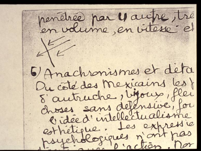
b) Anachronismes et détails:
Du côté des Mexicains les plumes d'autruche, bijoux, fleurs, toutes choses sans défensive, fournissant l'idée d'intellectualisme et d'esthétique. Les expressions psychologiques n'ont pas un rapport direct avec l'action. Non plus les gestes. Cela culmine dans la jeune fille (sans type ethnique) que pénètre une lance. L'invraisemblance de sa tranquillité affirme bien qu'elle n'est là, non comme personnage vivant, mais comme idée de douceur et de grâce.
Identique invraisemblance de l'Indien qui tient la légende explicative. La tristesse et l'effroi de certaines figures se rapportent plutôt à l'état d'abjection de la race indienne dans la suite des temps, que directement à l'action.
Du côté "espagnol," si j'ai choisi des armures rappelant celles du XIIIe s. (et non du IX siècle comme l'affirma un érudit en veine de gaffes!), c'est que leur aspect fermé (j'ai supprimé jusqu'aux visières), métallique, impersonnel, fournit mieux l'idée mécanique. J'ai voulu, non une réunion d'hommes, mais quelque chose comme une locomotive en pleine vitesse. Pour cela aussi, j'ai supprimé au maximum les détails humains (mains, visages) ne laissant que l'indispensable à indiquer l'esprit de sauvagerie qui anime cette masse.
Le groupe des spectateurs sur la droite est l'artifice ordinaire qu'employaient les artistes pour les visions ou représentations symboliques. (cf. : Apocalypse d'Amiens).
Ce mur a été exécuté tel qu'il a été conçu. L'idée fondamentale qui l'anime, exprimée avec une telle intransigeance, est peut-être injuste, mais la plastique ne se prête pas aux nuances.
At my arrival in Mexico, I was struck by the contrast offered by the spirituality of the Indian race and the mechanical civilization imported first from Europe and then from the United States. Between those two civilizations, there has been and is an impact as they are incompatible. One must yield to the other. Here the vanquished is the Indian mode. Such a "clash" between races could be anecdotal, but has general validity as the symbol of a conflict of more general character: between the search for the Beautiful and Good and that for Money and Pleasure. To make this plastically understandable, one had to pick an event and to depict in it those conclusions rather than the event itself. History suggests such a happening that perfectly fits this preconceived mold. The Massacre of the Indian nobles by Alvarado as they were performing a floral dance in the main temple (of Mexico City) (P. Duran as a source). The difficulty was that a strictly historical presentation of this incident would obscure its symbolical significance. The spectator, satiated by a display of archaeological knowledge, would not look further. I have purposely used anachronism as a hint to the onlooker that the spectacle witnessed is unreal, that it is the hieroglyph for a parallel happening on the intellectual plane.
The repartition of masses furthers the main idea. It is a totally unstable equilibrium, communicating the idea of motion. The accumulation of blacks at the top of the picture adds to this unbalance a feel of crush. Of the two clashing masses, one is interpenetrated by the other, of much greater volume, speed and strength.
Anachronisms and details. On the side of the Mexicans, ostrich plumes, jewels, flowers, all defenseless things that further the idea of intellect and of aestheticism. The psychological expressions and gestures are obviously unrelated to the action, to culminate in the maiden (lacking all ethnical features) pierced by a lance; her impossible calm well expresses the fact that she is not there as flesh and blood, but personifies grace and gentleness. Also unreal is the Indian who holds the explanatory caption: The sadness, the fright expressed by some, relate rather to the servile state of the Indian race in times to come than to the present action.
On the "Spanish" side, if I chose armors reminiscent of the 13th Century (if I have even avoided the representation of eye slits)...it is that their aspect--hermetic, metallic, impersonal--communicates better the idea of machinery. Rather than a grouping of men, I wished to suggest a locomotive running full speed. To this end, I avoided human details (hands, faces), leaving only what was suggestive of the spirit of cruelty that animates this mass.
The group of spectators at the right is the usual convention that was used by artists dealing with visions of symbolical presentations (e.g., the Apocalypse of Amiens). This mural was carried to completion exactly as it was conceived. The basic idea embodied, expressed without compromise, is perhaps unfair, but the plastic language is not amenable to nuances.
Mur : la pierre a été mise à nu. Il y en a de diverses sortes, dominant le tezontle.
Couche intermédiaire : Composée de ciment et sable appliqués en mouchetis dans la proportion de 1 de ciment pour 5 de sable.
Le ciment est du ciment Watson.
Le sable (sable de mine) a été passé au tamis, la partie grosse étant employée pour cette couche préliminaire, et la partie fine réservée pour la couche superficielle.
Travail sur la couche intermédiaire :
A été passé à la gouache blanche tout le tracé géométrique de la composition, celui-ci devant servir de point de repère pour le travail des raccords.
Couche superficielle :
Composée de [espace] de chaux pour [espace] de sable fin et du ciment variant dans la proportion de 1 pour 4 à 1 pour 7 de chaux et sable. Ce mortier, spécialement homogène (il ne m'a donné aucune irrégularité au séchage) fabriqué ainsi : la chaux, éteinte au préalable et en poudre fine, le sable fin procédant du tamisage, furent mélangés à l'eau et battus fortement. En laissant sécher le mélange deux mois environ j'ai obtenu un pain de mortier sec friable. Au moment du travail quotidien, on en distrait la quantité nécessaire. Réduite en poudre et ajouté le ciment, on malaxe à l'eau jusqu'à la consistance désirable. Ce mortier me semble bien supérieur à celui dont chaux et sable ne sont mélangés qu'au moment de l'usage.
L'épaisseur de la couche est d'un demi-centimètre environ; je l'ai employée soit lisse soit rugueuse, suivant les effets à obtenir, soit en relief (quelques boutons d'armure), soit en creux (jeu de fond au matoir) et incrustée de divers métaux.
Cartons : Le tracé géométrique sur papier, grandeur naturelle. Quelques études de détails, grandeur naturelle. Une aquarelle au 1/10e pour échantillonner valeurs et couleurs.
Le calque au moyen de la roulette.
Couleurs : en poudre mélangées à l'eau, posées avec des pinceaux doux. Le noir ne m'a donné qu'une adhérence médiocre. Le vermillon (lances) est posé à l'encaustique, pour laisser au ton son maximum d'intensité.
Observations : Pour composer ce procédé j'ai consulté : pour les matériaux, Paul Baudouin (la fresque, Paris, librairie centrale des Beaux Arts) et le maîtremâçon Luis Escobar. Pour ce qui regarde la peinture, Cennini et mon expérience personnelle.
A) Quoique la fresque sur chaux pure soit plus agréable que toute autre, j'ai cru devoir employer le ciment comme composant un mortier plus résistant et non rayable à l'ongle, suivant d'ailleurs les indications de Baudouin, riche d'un demi-siècle d'expérience : L'emploi du ciment pour la couche intermédiaire est recommandé aux pages 17 et 18 de son ouvrage.
Son emploi pour la couche superficielle à la page 22 : "la chaux grasse, la chaux hydraulique et le ciment ont des qualités variées et peuvent servir toutes trois à la préparation du mortier," et p 23 : "le ciment fabriqué industriellement et livré en sacs plombés s'emploie tel quel. Il faut se servir de marques reconnues bonnes". page 30, il recommande (chapitre : Préparation du mortier) de mêler au ciment du sable fin.
Je dois reconnaître que le ciment semble boucher les pores du mortier, rendant l'application des couleurs plus délicate. Il occasionne aussi un séchage plus rapide. Je crois pourtant qu'il faut l'employer dans toutes les parties destinées à subir des frottements ou exposées à des agents de destruction, la chaux seule n'offrant aucune résistance.

B) Quoique presque tout mon enduit soit lisse, la supériorité d'un enduit légèrement râpeux me semble maintenant évidente. La superficie étant, pour deux morceaux d'égales dimensions, 4 ou 5 fois plus grande dans le cas de l'enduit râpeux, l'adhérence des couleurs est elle aussi, quintuplée. DIAGRAMME En plus le pinceau sur un tel enduit accroche mieux et on évite les coulages; Le séchage est lent.
C) Cette peinture terminée il y a plus de 6 mois n'a subit aucun changement visible. Elle a résisté déjà plusieurs lavages à conséquence des traits et dessins à la craie et au crayon qu'y firent à différentes reprises les élèves de l'Ecole. Ces lavages n'ont pas altéré le coloris. Il n'en est pas de même des bariolages dont on l'a surchargée à l'aide de rouge pour les lèvres. Cette matière en séchant a pénétré les pores du mortier. Elle paraît maintenant adhérer avec force (mutilant la tête de l'enfant et la bouche d'un des guerriers), jouant le même rôle qu'une couche de cire.
Cette peinture pour reprendre sa fraîcheur nécessiterait un lavage au jet d'eau, opération délicate car la moulure supérieure, peinte à la détrempe comme les moulures du plafond, se désagrégerait à l'eau et coulerait, en salissant la partie fresque.
WALL. The stone has been exposed, of varying types, mostly "Tezontle."
SCRATCH COAT. Of cement and sand applied by throwing it with the trowel. In the proportion of one of cement to five of sand. The cement is Watson cement. The sand (mine sand) has been sieved, the rough part used for the preliminary coat, and the fine part reserved for the final coat.
WORK DONE ON SCRATCH COAT. All the geometric tracing has been transferred with white gouache, to serve as a guide to check the position of edges.
FINAL COAT. Composed of (1) of lime to (2) of fine sand, cement added in the proportion of 1/4 to 1/7 of the total bulk of lime and sand. This mortar resulted especially homogeneous and has given no irregularity whatsoever in drying... I obtained it thus: the lime slaked beforehand and in fine powder, the fine sand resulting from sieving, were mixed with water and stirred vigorously. By letting the mixture dry for about two months, I obtained a brittle dough of dry mortar. At the moment of daily work, the necessary quantity for the day is taken from the mass, reduced to powder, and cement is added, the whole is stirred with water until the necessary consistency is obtained. This mortar proved quite superior to the one in which lime and sand are mixed at the moment of work.
The thickness of the final coat is approximately 1/2 centimeter; I have used it either smooth or rough, depending upon the effect sought. In relief (some armor hinges), indented (background all-over pattern obtained with a stamping tool), and incrusted with diverse metal applications.
CARTOON. The geometric tracing done full size on paper. Also full size some studies of details. A water color, scale 1/10th, to sample values and colors. The transfer to the final coat was done with a pattern marker (roulette).
PIGMENTS. In powder, mixed with water, painting done with soft brushes. Black has given only mediocre adherence. The vermillion (lances) is applied in encaustic, to allow the tone its maximum intensity.
REMARKS. I decided upon this procedure after consulting for the materials used, Paul Baudouin (La Fresque. Paris. Librairie Central des Beaux-Arts) and the master-mason Luis Escobar. For the actual painting, I consulted Cennini and my personal experience.
A. Though fresco on pure lime is more agreeable than any other, I felt compelled to use cement to the end of strengthening the mortar, to the point where it could not be scratched with the nail, following anyhow the suggestion of Baudouin, result of half a century of experience. The use of cement for the scratch coat is vouched for, pages 17-18 of his book; its use for the final coat, page 22: "Rich lime, hydraulic lime and cement have diverse properties and can all three be used in the preparation of the mortar..."; and page 23: "Commercial cement delivered in sealed bags can be used as is. It is wise to use reliable brands."; page 30, in the chapter on the preparation of the mortar, Baudouin recommends to mix cement with fine sand.
I must acknowledge that cement seems to stop the pores of the mortar, making the application of colors more difficult; it results also in quicker drying. I believe however that it should be used in all parts exposed to rubbings or destructive agents, the lime alone lacking resistancy.
B. Though most of the final coat is smooth, I realize now that a slightly rough surface is obviously best; comparing two pieces of contrasting textures of equal areas, the contacting surface is four or five times greater in the rough than in the smooth coat, and the adherence of pigment is increased in the same ratio. FIGURE Furthermore, the brush bites better on such a (rough) surface, and drippings are eliminated; the drying is slow.
C. Completed more than six months ago, this painting has suffered no visible change. It has already been washed several times, the consequence of the scribbles and drawings in chalk and pencil with which the students of the school marked it from time to time. Those washings have not altered the coloring. One cannot say as much of certain daubs done in lipstick. In drying, this matter has soaked into the pores of the mortar and now appears to adhere strongly, defacing the head of the child and the mouth of one of the warriors; its reaction is similar to that of a coat of wax.
To recover its pristineness, the painting needs a washing with the hose, a delicate operation, because the upper wall molding is painted in distemper as well as the ceiling moldings; they would wash off under the action of water and drip, soiling the part of the wall painted in fresco.
The composition of The Massacre in the Main Temple. Extracted from Pictures and Picture-Making, Lecture VI, Tuesday May 24, 1938. Jean Charlot. Edited by John Charlot.
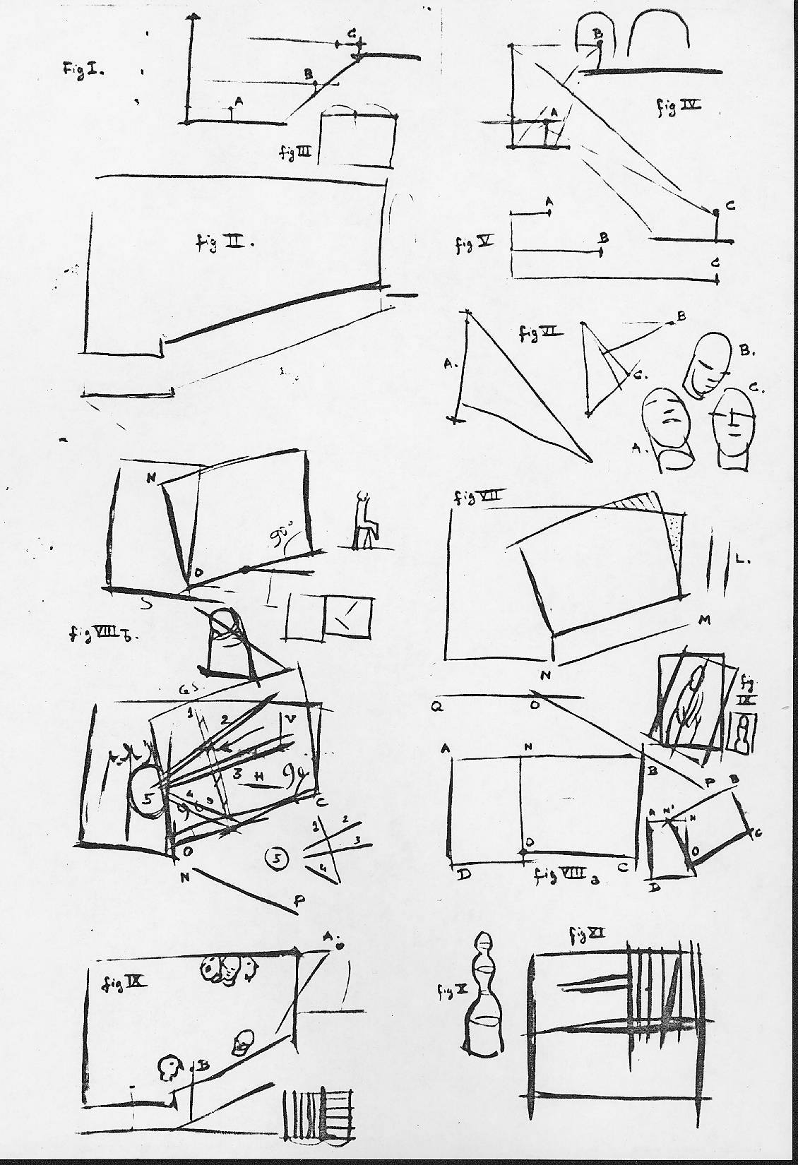
The minds of painters work mysteriously. When I say that Michelangelo and Picasso do this and that, I really don't know. I am engaging in guesswork. There is only one painter I do know about--I know the way his mind works--and that is myself. So I am obliged to take myself as a guinea pig. I will analyze, rather in detail, a mural painting I did in Mexico City. There are so many angles to it that I will have to simplify.
The question of the point of view is very important in this case. Mural painters are not like easel painters. They paint not only right on the wall, on those two dimensions of the plane, but also in relation to the other walls of the room. That is, they do nearly what a sculptor does: start from three dimensions instead of two. I want to discuss that little problem of mine, which was interesting because it was a very mural problem, as far removed from easel ones as possible.
The shape given to me to paint was not a rectangle, but distinctly different, Figure II. The lowest diagonal line represents a staircase going up. At the top was a kind of balcony, and at the bottom was the horizontal floor of a landing. We saved the lower part of the wall for a dado of cement, which gave us the final shape to be painted, a very different one from the simple rectangle on which one usually paints.
The rectangle has a certain simple arrangement of proportions--for example, the way the smaller side can be worked onto the larger, Figure III. But on my wall, the different simple proportions and angles that the eye can find are already so complex that the painter can either forget them entirely--go against the logic of the job that he has in front of him--or else he can be so obedient to those different shapes that his job is greatly simplified. This may seem paradoxical, but a medium that gives you complete liberty--like oil painting--offers so many possibilities, so many infinitely different ways of solving a problem, that it becomes very difficult. On the contrary, a woodcut with a pocket knife and a piece of wood is technically so difficult, the material has such resistance, that it proves much simpler because there are so few solutions to the problem. The mural painter works in a difficult technique, which gives him little leeway. If he is obedient to his material, it proves itself, not an added difficulty, but really a simplification.
There is a story about Pierre Puvis de Chavannes, the mural painter. The French government had an enormous room to paint in the Pantheon in Paris. They cut the wall into little chunks, and each chunk was given to a master painter, all of whom, except Puvis de Chavannes, were horrible academicians who had never painted walls or even, if I may say so, easel pictures, because what they did couldn't be called painting. They all gathered in the room to look at the walls together. Puvis de Chavannes, who had done murals before, came in with a little paint box and little pieces of wood. All the others just gathered in the middle of the room and looked at how big it was. That is all they knew how to do. But Puvis de Chavannes took his little box and started mixing colors and comparing them to the tones of the walls, the floor, and the ceiling. As he was very busy with his own little business, one of those gentlemen said, "Well, Chavannes, what are you doing there?" "I am trying to work with the wall." The man said, "The wall? What's the wall? Nothing! I am going to do a painting." Puvis de Chavannes said, "Well, you had better watch the wall, or the wall will fall on you." Not only did the wall fall on the bad painters, who had not taken their color samples, but it actually ate them up. Of the six or seven painters in that room, the only one whose paintings can be seen are Puvis de Chavannes'. They are done in a much quieter tone, but in a much saner way. This is an illustration of how obedient you have to be to your material in mural painting.
The problem of the point of view in the wall I had to do was quite difficult, Figure IV. There was a little landing, standing on which a person would see the painting from very close and at a very wide angle, the bottom of the picture slightly below the eyes and the top high above them, A. Then, from the landing, there was a flight of stairs going up to a balcony. The person standing on the balcony was about level with the top of the painting, so his point of view was from up down, B. Then there was a flight of stairs going down from the landing to a floor, a second rest between the steps. Someone standing there would see the picture from another perspective, from down up, C.
Besides this problem of different perspectives, there was the question of distance. Standing on the landing, one sees the painting from very near. The average point of view from the balcony was about medium distance. The person on the lower stairs could see the painting only from far off. I had here all the possibilities put together of point of view and distance, Figures IV and V.
As I said earlier, distance influences technique, Figure V. Van Eyck, painting a picture to be seen with nose on the canvas, A, could use those great marvels of detail that Flemish painters do so well. Rembrandt, working for the medium distance, B, knows not to put in details because they really couldn't be seen from there. But he still masters the textural possibilities. His brush stroke at that distance acts not only as color and value, but also through its sheer strength. Rivera, knowing his mural will be seen only from a great distance, C, can rely neither on details nor on textural differences and brush strokes. He has to do something that is not a painting in the sense that we use it now; that is, it cannot be handled in an arty way, but he has to do a kind of house painter job of it so that it will be seen correctly at a distance. So here I was with the problems of Van Eyck, Rembrandt, and Rivera, all at once.
I showed earlier that any defect in diagonal vision can be corrected according to points of view, Figure VI. If I know my picture is to be seen from down up, I can correct it so that the optical picture will look normal, as El Greco often did. A head seen from up down will appear in a natural position to the person above it, B. A head seen from down up will appear in a natural position to the person seeing it from below, A. For a person looking at the picture from a normal point of view, it would be correct for the head to be level, C. Each problem can be handled well by using the point of view. But again, I had people seeing my wall from all three points of view. I knew that if I used one single point of view--if I sacrificed any of those three positions--people would come in by accident, stand in the wrong place, look at the picture in the wrong way, and decide I was no good.
Those were two of the problems I had: distance and point of view. There were three chapters to each--the three places from which the mural would be seen--so six problems.
A further problem was the relation of the two-dimensional plane of the picture to the architecture. That in itself is quite a job, Figure VII. There were not only the verticals of the wall and the columns, L, and the horizontal of the landing, QO, that had to be represented in the picture. There was also the diagonal of the staircase. Everybody who looked at this picture had to deal not only with the diagonal side of the picture itself, but with the steps, which had a great physical reality and as such were really part of the picture. But the stairs were even more complicated. One flight, MN, came down at an angle from the balcony to the landing, QO. They then continued in the opposite direction and at an equal angle down from the landing to the lower floor, OP. This lower flight of stairs was seen when you looked at the painting from the balcony or the landing. Also, very important, the people who looked at the painting had the actual physical exertion of working themselves up or down on those two diagonals. They had a working knowledge of them, so I knew that if the mural didn't account for that strong perception and experience of the diagonals, it would remain a kind of easel picture--that is, it wouldn't have all the coordination that mural painting must have. So that was an entirely different problem from the others, but a very delicate one also.
First, I tried to arrange the wall in terms of a rectangle, Figure VIII. I had on one side of the wall an upright rectangle, ANOD, which I could use as a basis for my planning. On the other side, I was reminded of the plan or intention I discussed when I analyzed the El Grecos and Cézannes. In the portrait of Madame Cézanne, the picture was tipped; the composition had been planned on an upright with the axis of the body parallel to the sides of the picture itself, and then it had been tipped sideways, Figure IX, which made the picture seem larger than its actual physical surface. In this planning of the Cézanne were the two possibilities I had with my wall. I had the true verticals and horizontals of the actual physical picture on one side of my wall, and on the other side, I had a diagonal, which was or could be considered the horizontal that had been tipped. So I started by correcting this tipped effect, that is, by reconstructing the entire rectangle before part of it had been moved, a rectangle in which all the lines are horizontals and verticals, Figure VIII, ABCD.
I then made on this reconstructed rectangle all the measurements found in any easel picture: Golden Sections, horizontal middle, and so on. Then I pivoted the right part of that whole rectangle around the axis 0 in exactly the same way, I would say, that a truck dumps its contents. The left part, the upright rectangle ANOD, could be considered the dumping spot. Whatever would be inside the tipped rectangle NBCO would slide into the upright one. The actual eating up of that rectangle on the left suggests a kind of resistancy and a kind of absorption of one part by the other, which is a movement.
It is a rather simple scheme, but it helped me in many ways, primarily by giving me two rectangles to work on instead of the original, difficult form. Even if the right rectangle is partly outside of the wall, Figure VII striped area, and a part of the wall is outside of my picture, Figure VII dotted area, the scheme nevertheless simplified the problem of the wall's odd shape by giving me the notion of two rectangles--one that did not move and the other that moved and moved against and into the stationary one.
I will treat only briefly the connection of the subject matter of the mural to the composition. The subject is part of Mexican history and would take too long to explain in detail. It took me a life-long consciousness of things and events in Mexico to get a kind of picture of it in my mind that could be translated into paint. But I will try to tell you quickly the things that happened in my mind, that were there much before I had to start that picture, and how they connected with the picture itself.
As you know, Mexico is made primarily of two races, the Indian and the Spanish. I prefer to say white man, because lately the Spanish and the Indian have been fighting together against other white men. The Indian race is rather static in itself. It cannot be thought of in terms of movement. Tourists see those people squatting on the ground and think they are doing nothing there. Well, the Indian has a way of doing things without moving. It is contrary to a certain kind of animation where you get a lot of movement and nothing in the end. So for me, this static rectangle on the left of the wall became assimilated to the Indian for a number of reasons. True verticals and true horizontals are admirably fitted to the Indian character. The Indian is always in close contact with the ground, which is a true horizontal, and, in squatting, takes a very different shape and proportions from the white man. A white man sitting on a chair has those little tooth picks under him. He has no correct relation with Mother Earth, so to speak. He is just staying on his own little artificial tripod and can and does lose contact very easily with the true dimensions, with the true horizontals and verticals. But the Indian, sitting on the horizontal of the ground, is absolutely close to it, fitting it like a glove. What makes him sit is the vertical force of gravity. The Indian is so obedient to the laws of nature that, being pulled downwards by the law of gravity, he just gathers himself to the ground as far as he can go. So those two forces--the horizontal and the vertical--seem to me an ideal symbol of the Indian. So he is represented well by that unmoving, upright rectangle, ANOD.
The other rectangle, NBCO, which I compared to a truck dumping something on the ground, reminded me very much indeed of the white man. It starts from a level, OC, that is a little higher than the level of the Indian, DO. Any white man who goes to Mexico feels himself a little higher than the Indian, on the level of civilization and progress. So this seems an ideal representation of that difference--not too much difference. The rectangle NBCO is also hitched to the point 0 and is turning with a little pendulum movement around it. To us Westerners, this looks rather static, but to the Indian it looks like a dance, a jazzing up. So this rectangle seemed to represent the white man very well. Another point was that we do not have in this section the true horizontals and verticals found in the other part of the picture. They have been mussed up by dynamics. Something has happened, and the whole thing is topsy-turvy, like houses sliding after a flood. That is also part of the make-up of the white people: moving around so much they think they are getting better, and what they are doing is losing their sense of orientation. I am telling you what passed through my mind at the time. You mustn't be angry with me.
Before the tipping of the rectangle NBCO, the two rectangles were good neighbors. They were just rubbing elbows slightly along the line NO. But after the tipping, a large portion of the rectangle ANOD has been absorbed by the other, NBCO. That is, the Indian, to follow my image, has been compressed into the little corner at the left. Now that corner or the compressed rectangle ANOD even has the shape of a squatting Indian seen from the side, Figure VIIIb. The Indian has been forced into that little corner by the tipping rectangle, and this white gentleman, through his means of progress, has eaten up a good portion of what had been the Indian heritage.
So the scheme, the subject matter, came to me just through reasoning out the composition. It was evident now that in this mural the left part would be devoted to the Indian and the right to the white man. The whole principle, the whole geometry and dynamics, represent a clash between the two races. So this picture was going to be a battle. It was very easy to find the subject in history. For a government building, I had to get a regular historical subject. I chose the battle of the Templo Mayor, The Massacre in the Main Temple. The Indians were in the middle of a feast. They were dancing with flowers in their hair, and the Spanish gentlemen surrounded the temple, rushed in, and made them prisoner or killed them. That subject didn't come to me out of a book, but out of the natural geometry of the shape I had to paint.
Of course, one of the main lines I had to use was NO, the line by which the conquest in a certain way is effected. It was also the line that completed the tipped rectangle. I will discuss only the main lines of the rather complicated linear composition. Those Spaniards were armed with lances, which are marvelous for composing with lines, an excellent pretext for composing with a ruler.
One of the main points of the composition is marked by lance 1 Figure VIIIb. The lance is painted in different areas of brilliant, opposed colors, so that it is the first thing that catches your eye in that part of the picture. The lance marks the Golden Section of the rectangle after tipping.
I was also careful to do what Cézanne did in his portraits of his wife: to keep in some places the natural horizontal, h, and vertical lines, v, remaining from the original position of the rectangle. These lines work as diagonals in the present, tipped position of the rectangle, because they have become opposed to the tipped sides. But they would have been the true verticals and horizontals of the rectangle before it was tipped.
On the left is a series of standing Indian chieftains actually being compressed by the Spaniards coming in. There is also an action of lines dumping down, the lines of the lances coming in at the steepest angle from the top right, 2. I used other lines, 3, parallel to the bottom side OC and still others, 4, parallel to the lower stretch of the stairway from the landing to the floor, OP.
Those sets of lines were produced for different geometric, compositional reasons. But when we put them all together, we find that, of themselves, they constitute a final formation of lines pointing in a certain direction: to a place in the lower rectangle. Not only do they point, but they are oriented by the subject matter: as lances pushed forward by the Spanish. To receive those lines, there is a round shield, 5, to which they come. That shield gives unity to the whole scheme of diagonals, and at the same time, being plump in the middle of the upright rectangle, it links together the two parts of the mural, which otherwise would have a tendency to come apart. The lines of the lances are all vermillion, and the shield is pastel gray-green, a much more subdued color, so that the speed of aggression and the passive reception of aggression are expressed through color also.
To solve the problem of the different points of view from which the mural is seen, I had to compromise, Figure IX. If I had taken only the point of view of someone seeing the picture from down up, it would have been natural for all the faces to be seen in a strong down up perspective--a very agreeable effect from that one point of view. But that perspective would look like a deformation to someone who had climbed up to the balcony, A, because he would be looking at the picture from up down. So at least some of the faces had to be represented from up down. Then again, someone looking at the picture from the stairs, B, has to have a number of faces that are seen level, say, in profile. As you see, it was impossible to cater exclusively to any one of those three points of view, so I had to compromise. That is, you will find some of the faces at the top are in up-down perspective, some are seen from down up, and others again are on a level, so that all through the picture is a kind of medley of those three different points of view, which gives a baroque impression, like a Tintoretto perhaps--not in the handling, but in those different points of view. But it does so for a very conscious, very common sense reason, so that I didn't feel ashamed of it.
The mural is really larger than it looks in an illustration. The figures are about three and a half times natural size or a little more. It is a scene of battle and therefore of utter confusion. It does look like something accidental was happening--that is, if I put over my intention, which was that the subject matter, the picture, should look dramatic rather than architectural.
On one side, the Spanish people in their armor are dumping themselves over onto the group of Indians on the other side. For example, the vertical position of the Spaniard on the extreme right is coming to the diagonal position of the Spaniard in front of him, which represents that dumping movement I spoke of. The Indian people are passive, static, so, technically speaking, they afford a nice contrast to the dynamics of the Spaniards.
The suits of armor have been done in such a way as to suggest what armor meant to the people of the time: not picturesque museum pieces for display, but very functional machines. Those Spaniards could defeat the Indians because they had machines. The armor here is a symbol of the contact of the white man and the Indian through the ages. That is, this is not so much a historical picture as a symbolical one.
In the bottom right corner is a little group of people, portraits of myself and some friends. Well, why not?
More in:
John Charlot on Jean Charlot