Art Book—Jean Charlot

Art Book


Art Book. Jean Charlot. 1932–1938. U35

Previously unpublished. Edited by John Charlot.

# Editor’s note

Jean Charlot started writing his Art Book in 1932, according to the manuscript. He was using Notebook A [Notebook A is a ledger for writing an original with two carbon copies. Thus each page number is given to three sheets.][1], upside down and on the versos of pp. 18,658–18,640, in which he had written most of his essays in Mexico and his first essays in the United States on Eilshemius and Bouguereau. The manuscript is done in his style of the time: an outline or the salient points are written on the facing verso of the previous page. Illustrations are included. He was basing his work on his "Traité de Peinture" of 1920 with additions in 1922, which he mentions in his facing notes and which is now posted on the web site of the Jean Charlot Foundation: jeancharlot.org. He apparently used also loose notes, posted on the same site as "Notes on the Theory of Art". These are on a major theme of the treatise: point of view.

On the first page of the manuscript, Charlot has written: "Art Book (Sheed and Ward)", the publisher with whom Charlot was to work for many years. The complete introductory notes are:

Art Book (Sheed and Ward)

In the manuscript, Charlot first wrote the section that begins "Inasmuch as a picture is a material thing", page 18,658, and ends "the very same sheepish attitude that the Academic copyists, whom he fought, had towards drawing", page 18,645. He then wrote the section that now begins the treatise: "Why don’t you paint…", page 18,642, to "mere intellectual", page 18,640. He writes "Preface" before this section. This latter section may have been written in 1934; on the second copy of a later typescript, Charlot wrote by hand "T. de Peinture 1934".

Between 1934 and 1938 a twenty-two-page typescript was made, now in the Jean Charlot Collection. The typing was apparently done by someone else because Charlot’s manuscript was not always read correctly, mistaking, for instance, reality for railway, censorial for sensorial, line for lime, and pin for pane. Charlot made corrections and changes in pencil and pen-and-ink and made some illustrations.

At this time, Charlot probably wrote a concluding section, "Résumé", in Notebook A, later tearing discontinuous pages from 18,644 to 18,639 out of the notebook. "Résumé" is unfinished, repeats material in the previous writing, and was left untyped until the 1970s. Charlot did, however, use the final section of "Résumé" as a basis for a short note, "Points of View", which was typed but never published.

Charlot apparently never returned to his Art Book but used much of the material in his Pictures and Picture Making: A Series of Lectures, delivered at the Walt Disney Studios from April 12 to June 7, 1938. The transcript of the lectures was privately mimeographed by the studio. The lectures needed editing to turn them into a book, and the present sections of Art Book were too short to be more than chapters. Charlot may, therefore, have sent the publisher the transcript of the lectures along with the typescript of Art Book to give them an idea of the scope and intended style of the projected work.

Charlot’s materials for Art Book, described above, are presented in the following order:

  1. "Foreword" from the typescript with several illustrations prepared for it. The other illustrations marked can be found in the appropriate locations of the manuscript.
  2. The manuscript from Notebook A.
  3. "Résumé" typed from the manuscript.
  4. "Points of View" from the typescript based on "Résumé".

# Endnotes for "Editor's note"

  1. Notebook A is a ledger for writing an original with two carbon copies. Thus each page number is given to three sheets.

    ^reference

# Foreword

[Handwritten: Treatise of painting 1932. Erased: 36. The text is a twenty-two page typescript with pencil and pen-and-ink changes and corrections by the author in the Jean Charlot Collection. The manuscript is in Notebook A, pp. 18,658–18,640. Previously unpublished. Edited by John Charlot.]

“Why don’t you paint what you see?” The answer is “because we try to paint what we know.” If a [Replaces: the.][1] writer limited himself to jotting down overheard conversations, he would not be such a good writer. It is the same with optics.

Writers can expound at ease on the art of writing, but painters do speak of their trade, at least in words, more rarely. They are in this bastard position of being neither bona fide workmen—as carpenters, plumbers etc., are—nor, and even less, intellectuals. They are conscious of it and they are shy.

Their craft is certainly manual and their dominion over the material and their joy in handling it are typically of a craftsman. But while one understands easily the use of a table or a chair or of plumbing, and thus feels a social intercourse of exchange with their maker, one is more in [Original: at.][2] doubt concerning the good of a picture. It is one of those baffling objects that are rather a nuisance unless you know how to use them, like a piano.

A picture, in truth, is an object only in appearance. That is, a picture in the dark, though physically the same, is not any more a picture. It is only its optical projection into the human eye that gives it its sense and its worth. The physical object is just the projecting machine, and the optical image, the real picture, exists and functions only in this semi-physical, semi-spiritual world of the human brain.

That pigments laid on a canvas have anything to do with a representation of the world is not, in fact, apparent. Yet man, whose eye is trained at detecting the elements of natural spectacles, is quick to interpret otherwise meaningless patterns as its symbols. Thus, as Leonardo points out, do we see faces and monsters in the cracks of an old wall or a moving mass of clouds. Contrary to the layman’s opinion, it is not the representation of nature that is difficult but, if such be the aim, to sever the connection between painting and representation. The least clue of line or color, however faint, will set the associative power to work. Whatever distortions Cubism has sponsored, it could never wholly get rid of its guitar and its pipe!

But even to accept [Replaces: if we do accept.][3] as a postulate that painting better be representational does not solve the problem. What we know of the world, we know through stereoscopic vision, two distinct images whose near superposition gives us a sense of volume and space. Also, by moving we multiply those twin points of view, and the scene itself is in movement. In such a dynamic way do we accumulate enough visual data. Then the eye is ductile, able to focus on a single plan, blurring all others, and thus to isolate and detail. The eye does not embrace a scene; it grasps successively.

The best possible attainment of one who would paint “natural,” given the limitations of the medium, could be compared to vision with one eye through a peephole on an incredibly immobile spectacle, where all is thrown pell-mell into one single focus. This achievement, the so-called naturalistic painting, does deny the very laws of natural vision.

The binocular vision that creates volume and spaces, the focusing on parts, the movements of both the onlooker and the object, are all part of natural vision, and though they cannot be aped with paint [Replaces: duplicated in paint.][4], they can be suggested by a judicious use of the optical qualities inherent in the material [Cut: used.][5].

Then, there is this [Replaces: another.][6] gap between the thing seen and the thing known; it would have been easier fifty years ago to state that academic painters do represent the world as is. Then “science” had a kind of accumulative permanent meaning, and each optical fact being related to a physical one, the painting of a [Replaces: the.][7] collection of facts seemed to have a certain value as scientific data. To infringe on pure representation, to distort imaginatively, would have been a sin against science. Since those days, though, science, having trapped matter into the atom, did shatter the atom into something more like energy than matter. Thus the world, as modern science knows [Replaces: sees.][8] it, is reborn to mystery [Replaces: is full of mystery.][9]. Its laws are only relative, submitted to a kind of free will on the part of “matter.” Such unforeseen, such dynamism, must be built into a picture that is to reflect something of the scientific reality [Replaces: gives the scientific railway [sic: reality].][10] of the world. And this do we find only in the work of the greater subjective masters, while it is to be missed in the clear-cut, clearly labeled, so-called objective pictures.

It is not astonishing that both objective and subjective should beat with the same pulse. Our own human mechanism is also an integral part of the creation, and as the Chinese clearly expound, painting the laws of mountains and trees and river falls is but an introspective excursion.

Painting, even if we start our quest with the commonplace assertion that one must paint “real,” becomes on examination a very spiritual affair.

With its body as physical as is a chair or a table, its functioning confined to the sensorial fringe of our mental reactions, its aims of spiritual introspection, painting bridges our whole universe, and the painter whose job it is to build this new Jacob’s ladder [Replaces: the painter that produces this strange object.][11] will never cease to apologize for being neither a pure craftsman nor a mere intellectual.

Inasmuch [At this page of the second copy of the typescript, Charlot has written: “T. de Peinture 1934 (more in manuscript).” The manuscript is in Notebook A, p. 18,658 and following. On the first page of the manuscript, Charlot has written: “Art Book (Sheed and Ward).”][12] as a picture is a material thing, made of canvas and oil pigments, or of lime and colored powders, it obeys physical laws, is subject to recipes. From this angle books can be written on the making of paintings as books are written about carpentry and cooking. And the artist, on this plane, is primarily a good artisan, mastering the laws of his materials so as to obtain permanent results. The choice of canvas, a knowledge of the chemical properties of color [Cut: both single and mixed.][13], the proper way of applying them, are very soundly made the subject of special treatises, but those are painters’ books and of no direct interest to a layman.

That the average person is a potential art patron [Replaces: in need of art objects.][14] is not quite as evident [Replaces: apparent.][15] as the fact that he has good use for chairs and tables, needs to sit in comfort, to have things at elbow height and hand reach. A wall, painted al fresco or not, is as good a protection, while an easel picture is indeed a negative object, accumulates dust or leaves square marks [Replaces: traces square clues.][16] on wallpaper. So that inasmuch as the art object is physically of no use [Replaces: unsound.][17], to excuse its existence, to explain its reason to be, we must leave the physical and go to the spiritual. A painting is not as much the canvas and color as it is the optical residue that it leaves in the eye and the subsequent connotations on the nerves and brain. Being of universal existence, it must indeed answer a need at least as real as any physical need.

On the quality of its function there is disagreement. Some consider the art object as a luxurious addition to an interior, a kind of glorified decoration, different in intensity, but not in principle, from rugs and wallpaper designs. It is true that all these, painting included, are made of color laid on a flat plane. Whatever the humble or exalted intentions of the fine-art artists or of the rug maker, the colors thus laid on a plane will shine forth their intrinsic qualities, the lines and values will “do their stuff” in the eye of the onlooker, regardless [Original: irrelevant.][18] of what may have been the desires of their ordinator [OUP defines this rare word as “One who orders, regulates, directs, or governs.” Charlot spelled ordonator, influenced by the French ordonnateur.][19]. This decorative angle on painting is mostly sensorial, as unalterable and quasi physical a quality of painting as is the weight of the pigment or its chemical composition. Yet it affects equally the emotional capacity of the onlooker, as lines and colors per se are moving.

At this juncture between the body and the spirit of the work of art we may start our analysis of its components. We may arrive thus more securely at an appreciation of its scope and aim than if we started from the top, with a profession of faith concerning its spiritual import.

If we make a brush stroke on paper, things start happening. It is of course an element as primary as is a single cell in biology, but in the same way as the cell is made to illustrate [Replaces: illustrates.][20] the principles of life, growth, reproduction, this brush stroke may help us understand the mechanism of paint. While the paper is white and the ink is black, it is evident that those [Replaces: the.][21] two components do not exist any more in their integrity but build up a new quantity that we could call CONTRAST. The exasperation of both values when put together, though a spiritual quantity, becomes more characteristic than either of the physical, analyzable facts. The putting together of two separate elements on the canvas is not a simple addition of those elements, more alike a multiplication. New qualities are sprung that neither contained, so that even a thorough description of colors and lines will miss the point of a picture in the same way that an autopsy misses the soul.

Another quality created by this brush stroke and not specially evident from the definition of painting (to lay colors on the plane) is a rough but effective illusion of space. Be the black interpreted as a hole in the paper affording a vista on the background or as some object lying on the sheet of paper, space and volume, be it only aerial volume, are created.

Such humanized interpretation of abstractedly plastic facts corresponds to any stroke or scribbled line or change of value in a picture. The human eye is trained [Replaces: fed.][22] on natural spectacles, and the human mind is in the habit of attaching some objective reading [Replaces: meaning.][23] to any system of line or color. It would be a cleaner job if one could paint with line and color only or learn the laws of those elements per se. Such an attitude has been attempted in our time, but it denies our associative and interpretative habits, starting thus from an artificial, though theoretically exact, stand.

Three lines resembling a reversed lowercase letter h, or a flipped and reversed number 4. 
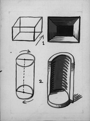
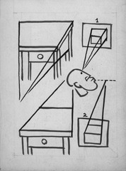
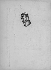
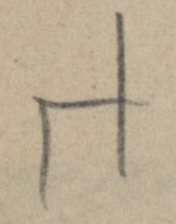
is a system of lines, but to man it is also a chair. is the sea. | a tree or a pole. Even more inhuman would it be to consider only as a system of lines such a sign as [Cut: this.][24] +. Even at this early stage of our inquiry, it appears evident that—however desirable it would be to isolate line and color in some kind of scientific vacuum, to study “art in the abstract,” as we moderns put it quaintly [Author’s note: So-called abstract art, an art in which colors and lines could be taken in their strict realities, shunning all imaginative connotation, would be, in fact, the only hundred-percent realistic art. It would oppose in a hardboiled common-sense attitude the cerebral meanderings necessary to interpret the so-called representational painting. But man is not so logical.][25]—by some inescapable process of our imagination, the outside world does get all mixed up with our diagrams.

If from a single white-black contrast we go to more complex sets of values, if we divide the black-white scale in four values, we obtain by putting them side by side the following figures (figure). As in the case of the brush stroke, those figures can be seen either as a kind of flag pattern on the plane or, and more easily, be interpreted into space, into planes set at angles to each other which would look as follows, set into perspective (figure). If the values, instead of sharply defined, are blended (figure), the shapes as suggested into space are modified to figure. In the case of the sharper contrasts (black white), we will have instead of the volume [Replaces: instead of the diminishing of the volume.][26] a break of continuity, as if two planes were seen at a distance from each other, creating this time not volume proper but space, which is after all an aerial volume. All painting is seen then as having a kind of double existence, each element a double meaning. There is first the actual painted surface, a single plane on which lines and colors have a formal existence in two dimensions only, the [Cut: emotional.][27] properties of the whole resorting to schemes of flat geometry and to the relation of lines as enclosed between the four sides of the painted rectangle (figure). Those same lines, reading them into space, have also [Replaces: lines, through the illusion of space which values bear to the human mind have also.][28] an illusory existence in three dimensions, in which the painted surface becomes an opening on space, as if it were a glass pane on a show case. The diagonals on figure will become then the reclining pyramid on figure, the circle will become the sphere, and figure the kind of cubic receptacle, figure.

There is no clash between the flat or decorative version of the figure and its realistic projection into space. All great schools of art have struck a balance between the two readings, some insisting on flatness as we see in Egyptian painting, some insisting on volume as did the Italian Renaissance. But even Italian perspective, by giving a means in appearance scientific of representing space, did not deny the two-dimensional reality of the picture. The perspective diagrams beloved of Uccello exist on the plane as diagonals, grouping themselves in elegant fan formations, and are esthetically affective both flat and in space [Replaces: are effective both in space and on the painted plane.][29] (figure).

That Italian perspective is only in appearance scientific comes from the fact that it presupposes the spectator watching the picture from a peephole that would correspond to the center of the horizon line, which of course is seldom the fact. The more correctly put into perspective, the more artificial does the picture become by shifting one’s point of view. As happens with those mediocre architectural theatre sets where the more perspective lines are in use, the more impossible the make-believe for the man in the aisle or in the balcony.

Space and volume are so inherent in painting as to be its inescapable corollaries [Original: Space or volume exists in painting as an inescapable corollary of the optics of the materials used.][30], but if we want to increase this sense of space by merely copying the scientific vision [Replaces: by mere copying ore the scientific vision.][31], far from helping the space sensation, we may weaken or even destroy it. The same happens in mechanics where the wheel does not duplicate the legs nor the plane the motions of the wing.

Indeed the “naïve” perspective of the pre-Renaissance is a much sounder performance than more scientific renderings. Because its receding lines, meeting in many points and on numerous levels or horizons, plastifies [The word is not used in Charlot’s sense of “giving something form or physical expression.”][32] simultaneously the successive changes of point of view, both horizontal and vertical, which do really happen to the onlooker in movement.

Even what can be called from a scientific point of view “counter perspective”—where the converging lines, instead of receding to an horizon, meet in the foreground—is, pictorially speaking, a most effective creator of space illusion. It represents [Replaces: embodies.][33] on the canvas the light rays that all converge on the eye of the spectator. Its creation of space in front of the canvas instead of in back is as powerful a means of interposing atmosphere between the onlooker and the object.

Another thing that incapacitates scientific perspective is the fact that the eye cannot focus near and far at once. Thus came into existence the neutral backgrounds of a Titian or a Rembrandt. Far from being a conventional cliché, their vacuousness is an accurate rendering of natural vision with the unfocused eye.

The relation and degree of dependency of the artist on nature is indeed a touchstone for his art. We do find that by applying paint on canvas we raise unavoidably problems of representation, but this does not mean representation to be the aim of art. It happens simply to be one of the qualities of the material used, as natural in the realm of optics as is on the plane of physics its gravity, its consistency, etc. As such, representation has to be dealt with to attain a proper knowledge of our trade, but only as a means, on the same footing with its other attributes. Supposing we could give a perfect duplicate of space—which we must be thankful cannot be done—and in this space set life-like objects or persons, we would be perilously near to disobeying His command not to carve nor to paint idols. The more life-like the painting, the more repulsive its aping of God.

A segment of line a considered in itself has no dimension whatsoever. It cannot be said to be either big or small. As soon as we add another, b, a can be qualified. We can now say that a is small—that is, smaller than b. Or big—that is, bigger than a third segment c.

The same is true of masses. A is not qualifiable until, for example, we put in it a dot b, which makes a very large.

Each picture can be said to be a world apart in which theorems similar in principle, though more complex, are enacted. Even if the canvas is bare, we have a rod to measure with—that is, its two sides, already qualified by comparison with each other. B equals b. b A. A B.

Which explains why in all great periods of art the limits of the painting have always been a starting point, the module that gives birth to the inner lines. More often this boundary is a rectangle, but it dictates even more thoroughly its own laws when it is a more complex figure, as may happen with architectural murals.

The comparison that the eye makes instinctively between the two sides of the rectangle may be graphically described by rotating AC ninety degrees to a C1 on AB, with A as center. This instinctive operation is at the root of the numerous compositions that employ the square constructed on the smaller side of the picture. A clean-cut illustration is the Moroni portrait in the Metropolitan, where the square is used for the painting proper, the remaining surface being used for the inscription. The painter emphasized the simultaneous existence of square and rectangle by tracing as a background the clues to two diagonals, one for the square, one for the rectangle. This latter, faint as it is, is the only device that keeps the two areas from falling apart.

The rather nerveless comparison < or > can of course be much refined when the two segments enter into some mathematical relation, one-half or one-fourth or the much ballyhooed “golden section.” There is a true aesthetic pleasure in comparing two segments of line or two surfaces and finding that they are related to each other in such proportions. Such comparisons are possible only with the recurrency of similar figures. The prevalency of the rectangular shape of the boundaries, canvas, or wall is no doubt responsible for the often recurring sets of horizontals and verticals that painters bring in under the guise of architectural settings. But comparisons between figures that are not based upon the rectangle are also possible. Each painting has as theme a dominant figure that corresponds to the key in music. Certain masters became addicted to certain figures: Renoir to the sphere, Greco to the ellipse, Uccello to the polyhedron. But more often do we encounter those solids which spring from the basic rectangle: the parallelepiped and the cylinder.

Translations.—Not only does the placing of similar figures on the canvas suggest comparisons as to proportion, but, and more important, it suggests also actual movements. The eye, though it grasps simultaneously in principle, in practice goes through one figure to its similar and is inclined to see the latter as if the first figure, being in movement, had reached the second position. It is the same principle as in a moving picture, but the movement is of the eye over the still picture. Two segments meeting at an angle, O, are seen by the eye as if one were rotating around O as a center. Two figures similar but of different sizes will suggest translation into space, a being A on the farther plane. Any system of parallels to the sides of the rectangle creates an illusion of receding planes and thus space to the infinite. The same principle is applied to the repeated arches of the Gothic porch. In the Vermeer illustrated we see a rotation of the rectangle of the picture to ninety degrees so that the larger side becomes horizontal, and also its recession into space. In many paintings we do attribute the effect produced to the moving actions, the dramatic expressions of the figures. But those are just a veneer, and the real beauty may depend more on the geometrical construction, the architectural background. The plastic center and the emotional center are often distinct. Thus the Vermeer (figure) emphasizes [Original: which emphasizes. both added from the manuscript by the editor; also added.][34] both the use of the rectangles issued from [Original: of.][35] the rectangle of the canvas itself and also the plastic subordination of the figure to Bones, as the Chinese call the inner construction.

The translation in space of flat figures creates volume, and thus the use of geometrical solids is validated as one of the authentic means of the painter’s trade.

Due to the rise of Cubism much stress, perhaps too much, has been laid on the excellency of volume in painting. While it is the tool par excellence of the sculptor, its use by the painter must be somewhat cautious. The true volume of which a painter may make legitimate use is the aerial volume between planes, the negative volume comparable to that of a plaster mould that the air makes by pressing around an object. The emphasis laid by certain painters on building up a volume that would compete with that of sculpture results in stripping the subject of its atmospheric envelope, in losing space, the painter’s privilege.

Whatever illusion paint may be capable of, it is unwise to force the material into unnatural channels. Soon it takes its revenge. In the case of sculpturesque illusion, for example, the effect, as that of scientific perspective, is possible only from one point of view and under one focus of light, conditions which never arise naturally. We saw that sound pictorial perspective recognizes a multiplicity of points of view. In the drawing of figures, the same thing happens as in architecture. Men like Cranach or Ingres are realists enough to accept the natural movements of both model and artist; their drawing describes around a model a gentle arc of circle, [Cut: their drawing.][36] being thus suggestive of time and space, and richer in content than a “peephole” snapshot.

Veronese in his Noces de Cana adopts three superposed horizons, which allows the spectator a vertical motion, a condition realized [Replaces: suggested.][37] probably by the staircases or galleries that must have faced the painting in its original position. Watteau goes further in applying this vertical motion in relation to personages. His models are rarely pictured as on a level with the spectator. Their faces are mostly seen in strong perspectives, from down up or from up down, affording the spectator the illusion of an ever shifting position over or under the painted horizon, gaining thus by pictorial means as thorough a definition of the subject as could be obtained by turning around a living model.

If composition on the surface of the picture can be to some extent defined, made the subject of thumb rules, composition in space, the means of ordering volumes, is a more elusive subject.

Titian gave an excellent definition of space composition, though in such an elliptic phrase as to make it puzzling, when he said that a painting must be like a bunch of grapes. The cluster itself is spherical and illustrates the total space to be found in the painting. Each grape participates in its spherical quality, yet each is particularized by its position in space in relation to all the others. Established logically around the main arteries, the stem and its derivations, the grapes clothe such directions as the flesh does the bones, making them discernible, yet not visible. Of course Titian did not mean that objects must be clustered in a painting as thick as the grapes in the bunch. As a true painter, he counted as volumes both the inner volumes of the solids and the aerial volumes of the space between them.

Cézanne wrote in very much the same terms to Bernard: [Editor: Charlot did not specify the passage. It may have been the famous letter to Émile Bernard of April 15, 1904, in which Cézanne mentions solids based on geometric forms composed in a space in which distances are defined by increasing densities of atmospheric blue; published in John Rewald (ed.): Paul Cézanne: Correspondance, Éditions Bernard Grasset, Paris, 1937, p. 259.][38].

This organization in space is the ultimate achievement of the painter. He creates and ordinates his own world, and what would be unholy if his world attempted to be a facsimile of God’s world becomes truly great if it is not a make-believe, but a parallel construction, depending not on imitation as an aim but on the knowledge of the optical qualifications of the material used.

However abstract the geometrical genesis of volume in paint, composed as it is of translations and rotations, volume will be illustrated in actual paintings by models, objects readily recognizable transposed from the outside world into the painted space.

Poussin, in his aesthetic testament, wrote: “Solids do not exist without light.” It is chiaroscuro, the distribution of light and shadow, that gives solids an optical birth, both in nature and in art, but essentially in painting.

The sculptor can rely on tactile confirmation; seeing a sculpture is, in fact, only a substitute for touching it. So that lights and shadows are not the subject of sculpture, only one of its superficial attributes. And thus pictorial sculptors, who rely on painters’ means, may be convicted easily by shifting the light source. Lincoln Memorial. (note)

Painters who construct their pictures mainly in two dimensions, using the outline of the bodies as a means of composition, are justly suspicious of what light and shadow may do when added to this originally flat scheme. A picture conceived flat is not enhanced by the addition of volume, and thus wisely do Oriental miniaturists subdue the volume, suggesting it by a minimum of slight modelings. Men like Botticelli worked mainly with lines. Later painters of the same type, Pontormo, Ingres, docile to the dictates of Occidental taste for more realism, feel compelled to carry the description of volume further, yet are afraid of disturbing the line balance. They use a compromise formula in which light does not come from any one focus, nor cast shadows, but—very much as is the case in chemical photography, by which objects impress a plate in the dark—the ratio of light augments when the object nears the plane of the picture, diminishes when it recedes. Thus sharp contrasts do not occur in the inner modelings. The silhouette remains dominant as primitively planned, and the surface harmony is kept intact. The solution, justified as it may be by such geniuses, though it does not impair the line construction and beauty of the picture, is rather an escape from the problem of volume than a solution. It tends to diminish both volume and space and does insist dangerously on the decorative.

To present a perfectly satisfactory solution of volume, a picture must be planned in space from the beginning. That is to say, its balance of composants must be between solids, not lines. To such a mind as that of the painter of space, outline is the most illusive part of a [Replaces: the.][39] solid, the uncertain frontier where the atmosphere begins and thus rather weak as a plastic tool. Each object is conceived like a battleground between light and shade, and the inner line that roughly defines those two territories is the active line that resumes the object. The projection on the canvas in two dimensions of a space composition would be meaningless if it was that of the objects outlined. It becomes active if the light-shadow borderline is considered.

A mixed example is considered in the diagram after Greco (figure).

The danger of deep space is in losing contact with the surface balance of the painting. A servile imitation of natural effects can open spaces and fill them with volumes, but then the frame of the picture becomes simply the open window. It must not be forgotten that the interplay of proportions and balance that constitute a picture is possible only between a number of elements limited to what man may grasp simultaneously. Unlimited vistas are not to be desired in paint. They are destructive.

Space composition and surface composition do not exclude each other. In fact, the former can be made sensible to the onlooker only through its tracks into the latter. It is the job of the painter to keep both in [Original: into.][40] their proper relation.

Though all geometrical bodies may theoretically be a theme for painting, practice reduces their number—to satisfy the law of multiple points of view—to very few.

Most excellent is the sphere, equal to itself from all points of view. A sphere painted once is as thoroughly described and from all angles as a sphere sculptured—hence the sense of fullness and satisfaction attached to its representation, its wide use, the instinctive transformation of natural bodies into systems of spherical approximates in the work of the masters, Rubens, Renoir.

Greco uses a sphere modified to an egg shape whose section is an ove [Charlot is using the French word for the architectural term ovum, an egg-shaped ornament of capitals and moldings.][41], the very shape of celestial bodies. Another set of solids to which the canvas naturally gives birth are those issued from its rectangle, approximates of the cube [Replaces: in popular language the cube.][42] around which so much has been written in connection with the moderns. The cube is both its ground plan and its elevation.

The pyramid is also a most paintable solid, a triangle being both its plan and elevation. Its ridges are oriented segments, converging or diverging, but always at work. The pyramid is still the favorite means of composition for academic painters, one of the few live remnants of the once sound tradition.

As contrasted with those that are painters’ material, all solids whose elevation and ground plan are dissimilar, for example, the figure, if painted, become static. That is, if the spectator is to believe in them, he must accept the convention of a single point of view. Such cannot achieve intensity in painting, while they are eminently a sculptor’s material, because of the unexpected changes when shifting the point [Replaces: the unexpected points.][43] of view.

VALUES. It is a popular error to think that volume becomes more “realized’ when light and shade increase in contrast. If such was the case, the maximum strength of a volume would happen when its values range from true white to true black. Yet the human eye, the same that looks at pictures, has looked for long at the natural world, finds [Replaces: and thus finds.][44] in it many convincing volumes, and has grown to appreciate them through a most delicate shifting of hues. A picture must treat the eye to at least as subtle a spectacle as the world does. If the painter, instead of pounding an approximate make-believe by an exaggerated construction of light and dark, is brave enough to state frankly the limitations of his material, he may rely on the optical nerves and brain of the onlooker to meet him halfway. A modeled drawing in silver point has never suffered in the rendition of volume from the fact that its darkest value is a light grey. This material limitation is on the contrary a fool-proof method of correct presentation. For though light and shade on an object are differentiated, yet they partake first of all of the local qualities of said object, its local color and texture, its position in space. More than contrasts, there are quantitative variations of the same quality.

Value contrasts control space, not volume: To each position in space [Cut: thus.][45] corresponds a distinct scale of light rendition, maximum and minimum tending towards a common meeting point as the object recedes into space, as more numerous veils of translucid atmosphere are thrown between it and us. The more economy of value the painter learns to use in rounding a volume, the more diversified his means of placing those volumes in their proper relations into space. This very reasonable convention is admirably illustrated by Poussin’s figure paintings.

Painters who are careless with values become incapable of ordering convincingly a number of personages or buildings in relation to each other. Perhaps the decrying of storytelling pictures and of neoclassic “machines” and the actual idolatry for simpler subjects is a result from this impotency more than a love for pure painting and art for art. David had an elaborate knowledge of the grammar of values that enabled him to carry on such complex plans as his Socrates Drinking the Poison. Degas, the last man to do genuine classical ordinances, did strengthen himself against the lack of ordered space [Replaces: against the bonelessness.][46] of Impressionism in his elaborate copy of the Sabines of Poussin.

The painter who wanted to describe volume had to introduce light into his paintings as the means. The painters who took the rendition of light as an aim ended by destroying volume. Turner and Monet to a great extent fulfilled their purpose. But without solids as landmarks, space does suffer too, and light alone, detached from its constructive qualities, is a poor result for such sacrifice.

COLOR. Values alone are a beautifully complete means of plasticity, and the Chinese ink school has produced masterpieces in black and white that no additional color could enhance. In the Occident, drawings and prints have used value alone without seeming incomplete.

However, the painter’s only tool is color. Color does not deny value, as to each color corresponds a value on the black-white scale. But the properties of color do modify and even contradict those of the corresponding value. Moreover, a complex of colors is subject to many more intercurrents than its corresponding complex of values.

Photography has had a very disastrous result on the appreciation of painting. The more does a painter make color active in his picture, the more impossible its translation into photographic values. A lemon yellow is not approached by a light grey nor a vermilion suggested by a medium grey. The contrast green-red is not even translatable, while the so-called chromatic plate adds to the mystification by straightening things only in appearance. Noncorrective plates show at least by looking wrong that the photograph misses something. There exists now a whole school of painters who believe they approach classical tendencies because they use mainly greys or grey hues of color. Having known most of the past masters through photographs of their work, it is natural that color is the last of the means of art of which they are aware. When placed in front of an original, color always comes to such painters as a rather shocking [Replaces: disagreeable.][47] surprise.

As a segment of lines needs at least another one to be susceptible of qualification (see page), so can it be said that colors do not exist singly. Only in their reaction to surrounding colors do they acquire distinction. Figure, considered per se (and we must make abstraction of the black and white that surround it), can be said to have no particular existence. Not until another color is laid beside it do those two exalt their particularities.

Two colors in equal quantities, as would two segments of line of equal length, do not leave in the mind any clear image. It may be said that they neutralize each other optically, so that a picture whose theme would be two equal areas of contrasting colors could not be said to be colored. Only when the proportion is thrown off balance (figure) do we attain a true color reaction.

The popular theory of complementaries is simply a statement of extreme contrasts—that is, the opposites on a series of scales that function to color as do black-white to value. But as extreme contrast of value is destructive to space and volume, so are complementaries to be avoided or used as sparingly as pure black or pure white. As the eye keys up to contrasts, it becomes blinded to subtler and really constructive differences. While a picture can be successfully built up on a single color theme, for example yellows, from lemon to orange, the introduction of their scientific complementary, blue-violet, will kill the picture by flattening all the yellows into one plane.

Painters have a leaning to use colors in a rather pure state because of the uncertainties of the chemical reactions in mixing them, and color, optically speaking, tends always towards its maximum intensity. This point of saturation happens for each color at a particular point on the black-white scale. Yellow is most intense at a value close to white, red and green about halfway, blues and purple nearer to black. So that color, far from being called at will, dictates its own laws to the painter. Local colors, if they are to be true colors, will be possible only in areas of their allotted values on the black-white scale. Thus do we see that in the case of a painter who paints dark, like Courbet, the shadows will be practically colorless, true color taking its refuge in the highlights (Courbet, in a letter to a friend, speaks of true vermilion as the proper highlight on the nose of his model. For painters who paint very clear, as does Matisse, who is ruled by the ecru tone of his canvas, colors can be at their intensity only in the shadows, color in the light being limited to yellow and weakened use of the others (hence the famous Matisse pink). Delacroix, whose favorite combination is red-green, keeps the tonality of his picture midway, at the exact value where red-green can be most intense.

Much more inclusive is the compound yellow-blue, favorite of both Greco and Vermeer, because it bridges most of the black-white scale. Vermeer’s ladies are dressed in yellow not on account of any feminine preference, but because it happens to be the only color that as high light may retain its maximum intensity.

Black and white take logically their place among colors as being the only match for the corresponding values. Used as colors, it can be said that black equals white. That is, the black accent in a very clear painting (eyes in Renoir) is as brilliant as a white accent in a dark painting (Rembrandt). They can be used only sparingly because both are destructive of space illusion.

Colors, as we have seen, are chained to values and thus, aside from the chemical limitations of pigments, there are further bounds; this does result in the grammar of color that will dictate to the painter his local colors with as much strength and more logic than do the actual colors of the model to the academic realist.

There is a geometry of color similar to that of the geometry of line. In this latter we see a segment of line give birth to geometrical figures by translation, and those in their turn by moving into space create volumes. So it is with color where, incipient to the first brushstroke, the logical architecture of the picture comes into being. When the eye locates a tone A on the canvas, it will make a note of all the tones A it can find, notice their relative position by drawing directions from one to the other. Thus if figure suggests a circle, the same with color introduced may become two squares (figure) or a triangle (figure). In this latter it is noticeable how the irregular shape of the spots makes it hard for the eye to notice their relative position. They become a background to the more clear-cut triangle.

Translation of color on the plane is thus an optical fact. It is as if one single point a would move to a1 then to a2 and back to a, with the eye following it in its course.

The importance of color translation is thus essential to make visible figures that are useful to the composition yet cannot be traced actually on the canvas. Supposing a line construction, one, a triangle acting as a diagonal from right to left, plus two points, the introduction of color in the same figure, two, may make appear a color triangle in diagonal left-right that will counteract and balance the first figure. In the same way a line construction that is purely static can be made alive by throwing it off balance with a superposed color construction. Thus in the Mantegna Shepherds a pyramidal arrangement of a most academic balance is modified and made alive by a bold diagonal color scheme. Those examples correspond to what, for a line, would be translation on the plane of the canvas.

But color, as is the case with line, can be made to move into space, can be used, as was line, to create its own space. In natural vision, most tones are at their full intensity when near the eye and are subdued as they recede. Thus a true vermilion will logically be conceived as on the plane of the canvas. A similar vermilion but toned down in intensity will correspond to a backward shift of the surface tone. Thus is space created.

Blue, as being the conventional atmospheric color, is used in Flemish landscape convention as a way of gauging space. The onlooker, by estimate of the amount of blue that modifies the local color of the object, learns its distance from [Original: to.][48] the foreground.

Yellow is by nature a foreground. So that the yellow-blue combination already mentioned not only bridges values and thus helps describe volumes, but also is naturally creative of space. Those colors are thus used in the Mantegna illustrated.

The use of color to create space happily corrects the incapacity that the painter encounters to make use of the correct diminishing size of receding objects. Backgrounds correctly rendered would become so small as to be inefficient in the composition, and objects would, as they do in photography, shrink past the limits of visibility. Painters, consciously or not, ignore this perspective rule and tend to present the objects at a standard size. Color becomes then the welcome means to help realize their position in [Original: into.][49] space.

Of all painters Poussin is perhaps the one who used with more thoroughness the space-creating properties of color. In the [Replaces: Indeed.][50] Saint Peter Curing the Sick, the orange-red of the tunics in the foreground turns to true red in the middle distance, then, as the people recede, to a wine-red, purple, and light mauve. Poussin did choose the local color of the garments of his personages with such logic as to typify the space relation of the figures already strongly ordained by the geometry of the line architecture. Each point is defined by its two coordinates, line and color. Since the personages are standing only a few feet from each other, we are dealing [Original: The personages standing only a few feet from each other, we deal.][51] with a purely cerebral, not optical, rendition of an atmospheric degradation of tone.

Those constructive properties of color were totally ignored by Impressionism, which by following blindly the more accidental aspects of nature was led to use pigments regardless of their innate properties, only through their mental association with visual memory. In this sense, it can be said that Monet was less a colorist than Poussin or David. He sponsored in regard to color the very same sheepish attitude that the Academic copyists, whom he fought, had towards drawing.

# Endnotes for "Foreword"

  1. Replaces: the.

    ^reference
  2. Original: at.

    ^reference
  3. Replaces: if we do accept.

    ^reference
  4. Replaces: duplicated in paint.

    ^reference
  5. Cut: used.

    ^reference
  6. Replaces: another.

    ^reference
  7. Replaces: the.

    ^reference
  8. Replaces: sees.

    ^reference
  9. Replaces: is full of mystery.

    ^reference
  10. Replaces: gives the scientific railway [sic: reality].

    ^reference
  11. Replaces: the painter that produces this strange object.

    ^reference
  12. At this page of the second copy of the typescript, Charlot has written: “T. de Peinture 1934 (more in manuscript).” The manuscript is in Notebook A, p. 18,658 and following. On the first page of the manuscript, Charlot has written: “Art Book (Sheed and Ward).”

    ^reference
  13. Cut: both single and mixed.

    ^reference
  14. Replaces: in need of art objects.

    ^reference
  15. Replaces: apparent.

    ^reference
  16. Replaces: traces square clues.

    ^reference
  17. Replaces: unsound.

    ^reference
  18. Original: irrelevant.

    ^reference
  19. OUP defines this rare word as “One who orders, regulates, directs, or governs.” Charlot spelled ordonator, influenced by the French ordonnateur.

    ^reference
  20. Replaces: illustrates.

    ^reference
  21. Replaces: the.

    ^reference
  22. Replaces: fed.

    ^reference
  23. Replaces: meaning.

    ^reference
  24. Cut: this.

    ^reference
  25. Author’s note: So-called abstract art, an art in which colors and lines could be taken in their strict realities, shunning all imaginative connotation, would be, in fact, the only hundred-percent realistic art. It would oppose in a hardboiled common-sense attitude the cerebral meanderings necessary to interpret the so-called representational painting. But man is not so logical.

    ^reference
  26. Replaces: instead of the diminishing of the volume.

    ^reference
  27. Cut: emotional.

    ^reference
  28. Replaces: lines, through the illusion of space which values bear to the human mind have also.

    ^reference
  29. Replaces: are effective both in space and on the painted plane.

    ^reference
  30. Original: Space or volume exists in painting as an inescapable corollary of the optics of the materials used.

    ^reference
  31. Replaces: by mere copying ore the scientific vision.

    ^reference
  32. The word is not used in Charlot’s sense of “giving something form or physical expression.”

    ^reference
  33. Replaces: embodies.

    ^reference
  34. Original: which emphasizes. both added from the manuscript by the editor; also added.

    ^reference
  35. Original: of.

    ^reference
  36. Cut: their drawing.

    ^reference
  37. Replaces: suggested.

    ^reference
  38. Editor: Charlot did not specify the passage. It may have been the famous letter to Émile Bernard of April 15, 1904, in which Cézanne mentions solids based on geometric forms composed in a space in which distances are defined by increasing densities of atmospheric blue; published in John Rewald (ed.): Paul Cézanne: Correspondance, Éditions Bernard Grasset, Paris, 1937, p. 259.

    ^reference
  39. Replaces: the.

    ^reference
  40. Original: into.

    ^reference
  41. Charlot is using the French word for the architectural term ovum, an egg-shaped ornament of capitals and moldings.

    ^reference
  42. Replaces: in popular language the cube.

    ^reference
  43. Replaces: the unexpected points.

    ^reference
  44. Replaces: and thus finds.

    ^reference
  45. Cut: thus.

    ^reference
  46. Replaces: against the bonelessness.

    ^reference
  47. Replaces: disagreeable.

    ^reference
  48. Original: to.

    ^reference
  49. Original: into.

    ^reference
  50. Replaces: Indeed.

    ^reference
  51. Original: The personages standing only a few feet from each other, we deal.

    ^reference

# Résumé

[This final section of the treatise was not typed at the same time as the preceding. Charlot had removed the pages from Notebook A, and they were typed in the 1970s. He did not make corrections or additions to the transcript. Charlot used the last paragraphs as a basis for a short note, “Points of View”. Edited by John Charlot.]

Résumé: To describe the mechanics of painting, we had to separate its diverse elements and speak of each as if it were a distinct entity. This would be most misleading if it was to be considered as more than a subterfuge for the sake of clear exposition. One likes to see the inside of a watch and to put the pieces apart, but it must be put together again if we want the watch to mark time.

Line [Cut: in pictures is the meeting frontier of two colors, values are an attribute of color cannot be isolated from.][1] and values are in practice a qualification of color; composition on the surface and space composition are one. The elements are as complexedly woven together as are in a body the blood vessels and the nerves.

As the different qualities expounded are inherent in the material used or more exactly are inherent in the optical image formed—they do not depend for their existence upon the artistic creed [Replaces: opinions creeds.][2] of the painter. If he recognizes their existence and has enough knowledge to handle them, the picture will be optically sound. If he denies them and uses paint purely for its imitative [Replaces: reproductive.][3] connotations or as an outlet for his “abstract” subconscious, the qualities inherent in the material will not for that cease to exist. Each stroke, each line will bring [Replaces: build.][4] its share of mechanistic potentialities, the only difference being that brought together in an haphazard way, the result stands a good chance of being a bedlam of incompatibles, as a result, a dead thing.

The problem does not overlap [Replaces: touch.][5] that of representation. The organization of a picture can be sound or not, irrespective of its being “abstract” or representational.

The relations of painter and nature are the subject of the subsequent chapter.

We have seen that painting is a complete world in itself. Paint can create space and volume and movement and light. It does not mean, of course, that its aim must be the representation of natural spectacles, but that qualities inherent in the material make it able to produce such effect. It has been used in all ages independently of strict representation (so-called decorative arts), and our time has especially challenged the validity of representational painting. Main modern veins, Cubism and Surrealism, even if they outlaw [Replaces: exclude.][6] each other, agree on one point: painting must not look “natural.”

Yet if we can imagine abstract art as ideally fulfilled, we see that (see p. 3)

Man whose eye is trained on natural spectacles is quick to read [Replaces: relate.][7] otherwise meaningless patterns [Replaces: shape.][8] as its symbols. Thus as Leonardo points out, do we see faces and monsters in the cracks of an old wall or the moving mass of the clouds. Contrary to the layman’s opinion, it is not the representation of nature that is difficult [Replaces: impossible.][9], but to sever the connection between painting and representation. The least clue of line or color, however indirect [Replaces: removed.][10], will set the associative power to work. Whatever distortions Cubism has sponsored, it could never wholly get rid of its guitar and its pipe. It thus remained in the category of representational painting, even if it is imperfect representation.

abuse of “nature”

traditional attitude

Our mind is so wickedly associative that in front of a so-called abstract painting it [continues] to work and find out under their disguise, what natural vision started the painter to work (for painters, as do laymen, possess associative visual memory).

Having found out, the spectator is quite likely to feel so relieved that he will forget to enjoy the painting as painting.

It may be said that a deliberate avoidance by the artist of clear representation is liable to make the painting, for the onlooker, as wholly a problem in representation. In the words of Pascal, “He who boasts of being an angel, becomes a beast.” “Photographic” representation is the other extreme. This, as we have seen, falls short [Replaces: wholly wrong.][11] of its goal because it does not take into account [Replaces: waves aside.][12]: choice [Replaces: natural choice.][13] of successive focuses [Cut: on parts.][14], binocular vision, movement on the part both of the onlooker and the object; moreover [Replaces: most of all.][15], by using the material of paint without regard to its inherent qualities and compound qualities, the painted spectacle ends in disorder. Its aim being to paint what one sees, it sins also against the spiritual possibility of paint: to paint what one knows.

By observing the work of the Masters, we see how they choose a wise middle course in their tranquil knowledge that a natural appearance is not a hindrance [Replaces: destructive.][16] to good painting. They insist on clear representation. The onlooker seizing at first grasp the subject will be moved by its emotional storytelling implications, but will not have to grapple with the painting to figure a subject matter. The representational angle is thus cleared at the start, and the road is free for the appreciation of painting as such.

mirror     shadow on a cave.

as the angels perceive body through spirit . . . . .

Canon

particularizing.

wrist calligraphy—moral calligraphy.

This wise acceptance of nature as an element in art is simply the craftsman’s acknowledgement of [Cut: another of.][17] those qualities inherent in the material, at least as digested by the human brain.

The world as a spectacle [Cut: We have seen that.][18] is somehow different from the world as a utensil. That is, our sensorial reactions are trained satisfactorily enough so that we can compute the distance from ourselves to other bodies with enough accuracy not to bump into them.

Our eye knows enough to distinguish hard from smooth, gauge distance and elevation, help us put a name on beasts and things. We can even judge of the character of people at a glance and act with them accordingly. But this purely pragmatic use differs from the use we make of a painted representation of the world. There we are in presence of a make-believe, and though we consent to be fooled, we know that our safety is not in the balance. So that a painting has to appeal to an eye somewhat dispossessed of its utilitarian training, ready to indulge—and the brain too—into a fling [Replaces: pass.][19] between working hours, what Poussin calls aptly: “delectation.” Some commentators have linked delectation with a kind of laziness, of aimlessness. But though no utilitarian point is at stake, the optic nerve remains connected both with heart and brain. Those will work on the material propounded—interpret it, and mindless [Replaces: dropping.][20] of its more immediate connotations, read its more remote, if not less real, spiritual meaning.

Such theories of pictorial enjoyment as that much publicized one of “tactile values” suggest that the painter can give a more real presentation of the object, of its smoothness, ruggedness, etc., than the onlooker would perceive in [Original: of.][21] the model—and that this more real than real is the source of enjoyment. If this could be achieved by the artist, it would perhaps please a dog (especially if odors could be thus emphasized), but man uses too much [Cut: his.][22] imaginative associations to be satisfied so. The contrary is much nearer the truth. The artist by giving a dubious, incomplete rendering of the objective world forces on the onlooker the realization that this physical world is not so real after all, that its meaning is not so much per se as that of a reflection in a mirror, or the shadow on the wall, of truer things.

The very shackles of pigment limitations do free the onlooker. Painting trains [Replaces: by training.][23] men to connect optical vision and spiritual vision. We may suppose that angels, through direct knowledge of the spiritual idiosyncrasies of a man, can come to conclusions as to his physical appearance. In reverse process, the painter, starting from the physical, must rise to conclusions as to the spiritual.

Mayan painting     note on m p. (Forma)
                                            Fresco of Tigers (manuscript)

personal cuota [sic] rework from Carnegie book

Weston book & foreword

Mexico = Art Interpretations.

Mex engravers       Manila
                                                Posada

Merida = need No 1 (Contemporaneos)

Pintao = rework with part on modeling? = Sculpture against modeling

need = Merida (Contemporaneos) et son catalogue
             Saln [Salu?] article (Hand H.)

drop = wood cut
            Asimilando

# Endnotes for "Résumé"

  1. Cut: in pictures is the meeting frontier of two colors, values are an attribute of color cannot be isolated from.

    ^reference
  2. Replaces: opinions creeds.

    ^reference
  3. Replaces: reproductive.

    ^reference
  4. Replaces: build.

    ^reference
  5. Replaces: touch.

    ^reference
  6. Replaces: exclude.

    ^reference
  7. Replaces: relate.

    ^reference
  8. Replaces: shape.

    ^reference
  9. Replaces: impossible.

    ^reference
  10. Replaces: removed.

    ^reference
  11. Replaces: wholly wrong.

    ^reference
  12. Replaces: waves aside.

    ^reference
  13. Replaces: natural choice.

    ^reference
  14. Cut: on parts.

    ^reference
  15. Replaces: most of all.

    ^reference
  16. Replaces: destructive.

    ^reference
  17. Cut: another of.

    ^reference
  18. Cut: We have seen that.

    ^reference
  19. Replaces: pass.

    ^reference
  20. Replaces: dropping.

    ^reference
  21. Original: of.

    ^reference
  22. Cut: his.

    ^reference
  23. Replaces: by training.

    ^reference

# Points of View

[The original of this note is a one-page typescript in the Jean Charlot Collection. Based on the ending of Charlot’s “Résumé”, this note seems to have been prepared for separate publication. Edited by John Charlot.]

The world as a spectacle is somehow different from the world as a utensil. That is, our sensorial reactions are trained satisfactorily enough so that we can compute the distance from ourselves to other bodies with enough accuracy not to bump into them. Our eye knows enough to distinguish hard from smooth, gauge distance and elevation, help us put a name on beasts and things. We can even judge of the character of people at a glance and act accordingly. But this purely pragmatic use differs from the use we make of a painted representation of the world. There we are in presence of a make-believe, and though we consent to be fooled, we know that our safety is not in the balance. So that a painting has to appeal to an eye somewhat dispossessed of [Original: from.][1] its utilitarian routine, ready to indulge—and the brain too—in [Original: into.][2] a fling between working hours, what Poussin calls aptly: “delectation.” Some commentators have linked delectation with a kind of laziness, of aimlessness. But though no utilitarian point is at stake, the optic nerve remains connected both with heart and brain. Those will work on the material propounded, interpret it, and mindless of its more immediate connotation, read its more remote, if no less real, spiritual meaning. Such theories of pictorial enjoyment as that much publicized one of “tactile values” suggest that the painter can give a more real presentation of the object, of its smoothness, ruggedness, etc., than the onlooker would perceive in [Original: of.][3] the model, and that this more real than real is the source of enjoyment. If this could be achieved by the artist, it would perhaps please a dog (especially if odors could be thus emphasized), but man uses too much imaginative associations to be much tickled by it. The contrary is much nearer the truth. The artist by giving a dubious, incomplete rendering of the objective world forces on the onlooker the realization that this physical world is not so real after all, that its meaning is not so much per se as that of a reflection in a mirror, or the shadow on the wall, of truer things. The very shackles of pigment limitations do free the onlooker. Painting trains men to connect optical vision and spiritual vision. We may suppose that angels, through direct knowledge of the spiritual idiosyncrasies of a man, can come to conclusions as to his physical appearance. In reverse process, the painter, starting from the physical, must rise to conclusions as to the spiritual.

# Endnotes for "Points of View"

  1. Original: from.

    ^reference
  2. Original: into.

    ^reference
  3. Original: of.

    ^reference

More in:
manuscript from Notebook A
"Notes on the Theory of Art"
English Texts

Contact, copyright, credit
Jean Charlot & The Jean Charlot Foundation